Ever been dwarfed by an armchair when you sit in it? Your knees don’t reach the edge of the cushions so your legs stick out like a toddler on a dining chair….
I will never understand the monolithic furniture trend.
Small square footage is often the norm in big cities and can make decorating feel like an impossibility with furniture these days.
Tiny rooms require big work, but when done right, you’ll never feel constrained by your square footage again.
The Furniture
A small living room is tricky because you need adequate seating but don’t want your space to look like a furniture showroom. The solution? Have pieces that can serve more than one function.
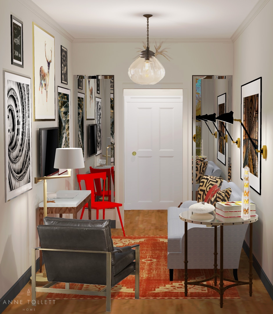
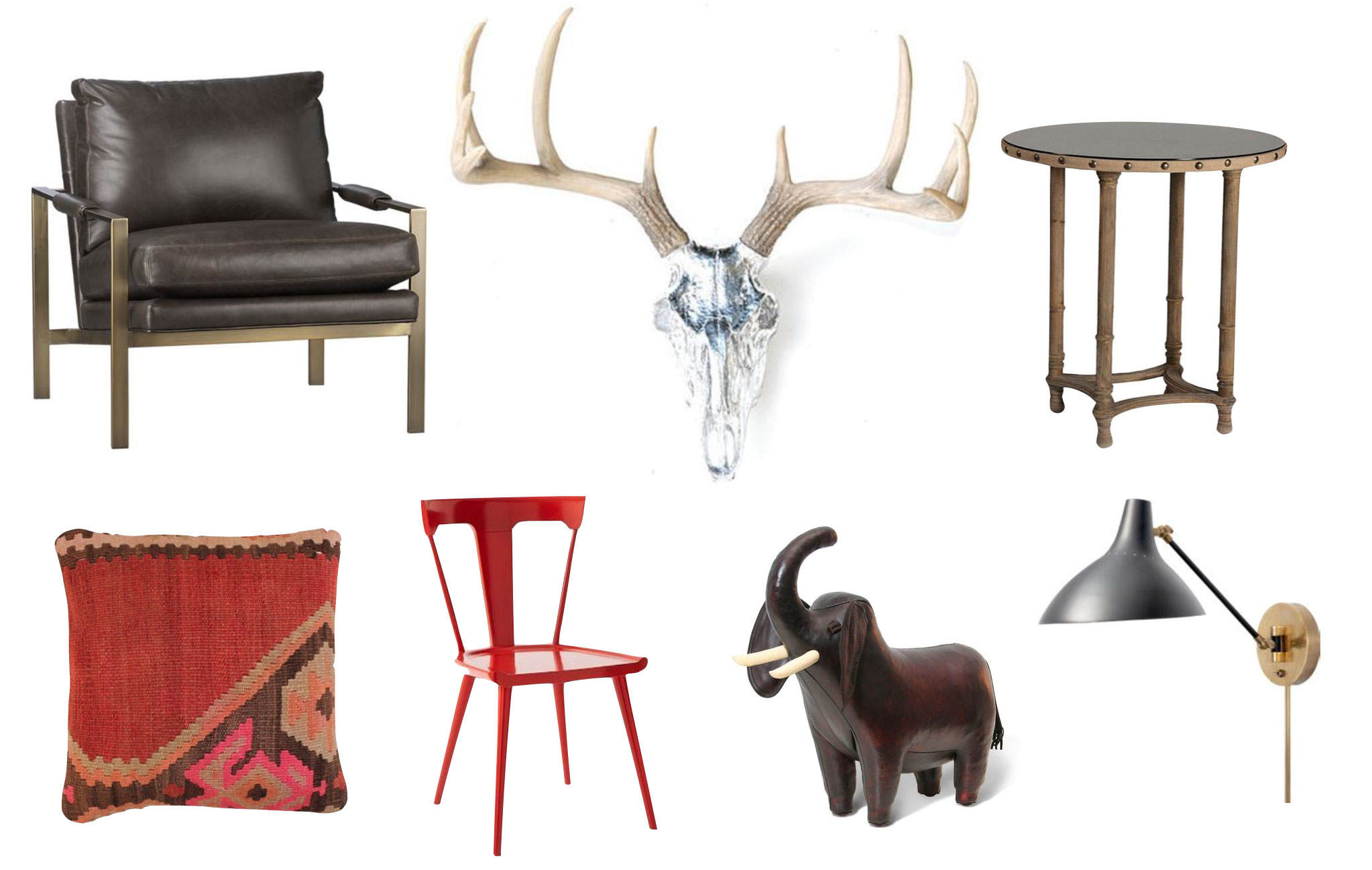
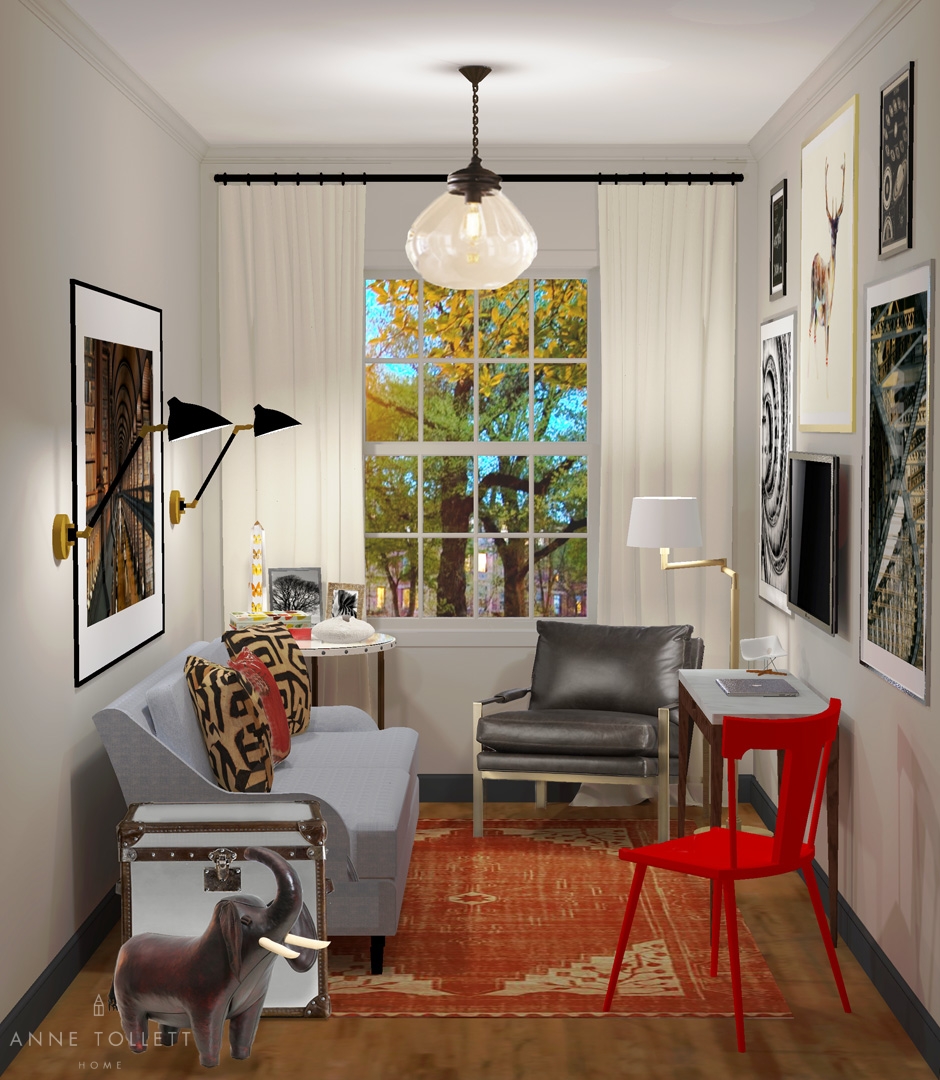
This console creates an anchor for the TV, as well as a workspace, while the adorable red chair can be used to seat a guest when it’s not being used at the desk. The swing arm lamp functions as either a reading light for the chair or task lighting for the workspace, and the trunk provides necessary storage while serving as an end table. And the sweet leather elephant? It’s not just a piece of art; it’s also a footstool.

To fit adequate seating in so little space, we chose furniture with a generous feel despite their lean profiles. Selecting pieces without skirting keeps the room feeling open while the silhouettes of the legs create visual interest. (P.S. This leather chair looks crazy expensive in person but it’s not. Bonus!)

The crown mouldings and window trim are painted the same gloss finish. This continuity of the visual plane creates an illusion of space as sight lines go uninterrupted by trim color. We also recommend painting the baseboards Ben Moore’s “French Beret” (1610), because it creates the appearance of a larger floor surface.
To see this baseboard technique in a real space, click here and scroll down.
The Fabric & Finishes
This room packs a ‘textural punch’ without overwhelming the space. This is a delicate balance which is achieved by repeating themes throughout the room.
The leather of the elephant cleverly echoes the leather of the armchair without feeling contrived. A chrome skull introduces a metal element that’s reflected in the bronze of the armchair and brass of the lamps. Variations of red are the only repeated hue.
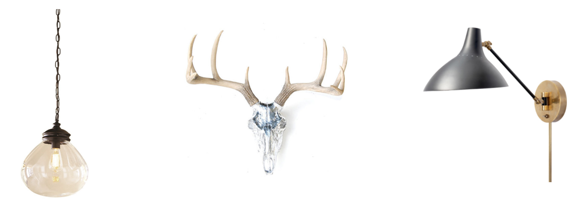
When a room is small, it’s critical to edit accessories. We love seeing a mid-century sensibility collide with a global vibe, so we were mindful down to the books we selected! A mini Eames chair, a large and textural low vase, lucite obelisk, and perfect picture frames…. When there is so little space, each piece must carry its own weigh while harmoniously adding to the room’s story.

The Accessories
The art and accessories are interesting confined to a neutral palette. This lends a ‘gallery’ feeling without making the room appear cluttered. Surrounding the TV by art makes it less intrusive because it becomes part of a collection. And a large photograph on the opposite wall is used to balance the room, while its supporting sconces double as table lamps.

The Layout
This space is only 8’x12’, but the plan could work for a room as small as 7’x11’. And in the weeks to come, I’ll show you how this scheme can work in a much larger room.
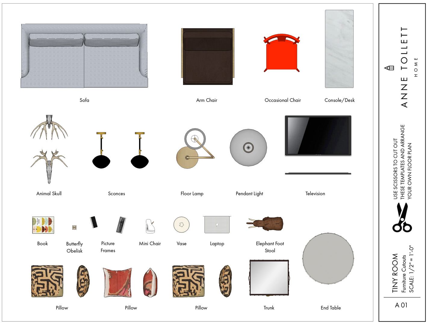
The floor plan in your house will likely be different from the one pictured here. That’s not a problem! Right here we show you how easy it is to reconfigure everything from the Tiny Room in your own space.
At last, you can stop making costly design mistakes!
Here is a rendering just for you, a scaled printable floor plan with elevations, and a buying guide of where you can buy every item in this room.
Embrace the space–especially when it’s small enough that you can touch both walls lying on the floor. (P.S.- You have to be 6’ tall to do that. I only know because I am the 5’11″ weirdo who tried it!)
Happy Shopping!
xoxo
Anne
