“Babe, this is gonna make game day AMAZING!”
Raise your hand if you’re married to this guy? We can’t count the number of times we’ve had to ‘design around’ an enormous TV. And let’s face it, a humongo TV makes some people happy on Monday nights when the game is on, and makes everyone else happy on Sunday nights when Game of Thrones is on, so win-win! Since we all love the big black box, designing around a TV becomes a fun design challenge instead of a decorating nightmare. Here’s how we made it work in this space!
The Fabrics and Finishes
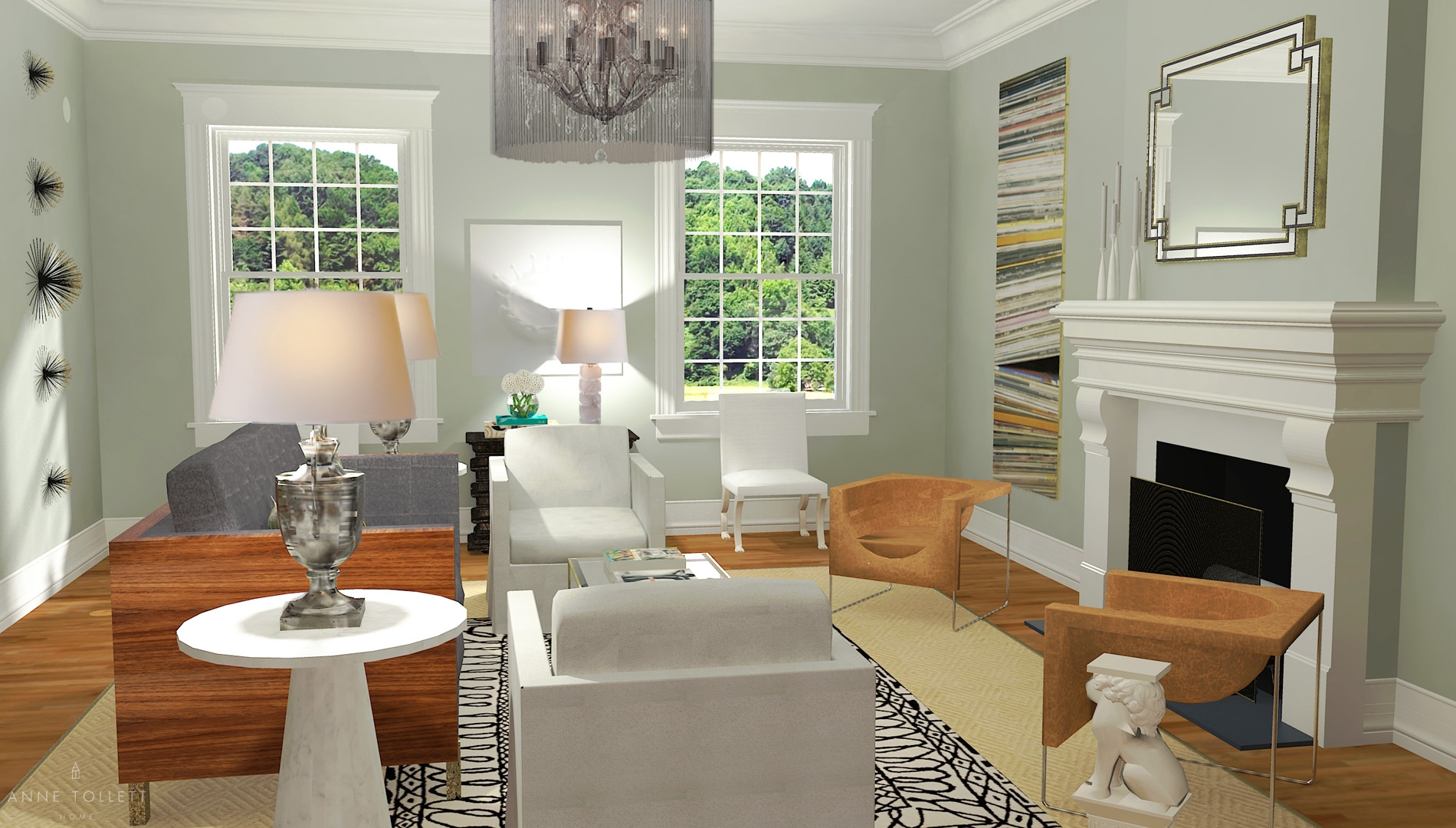
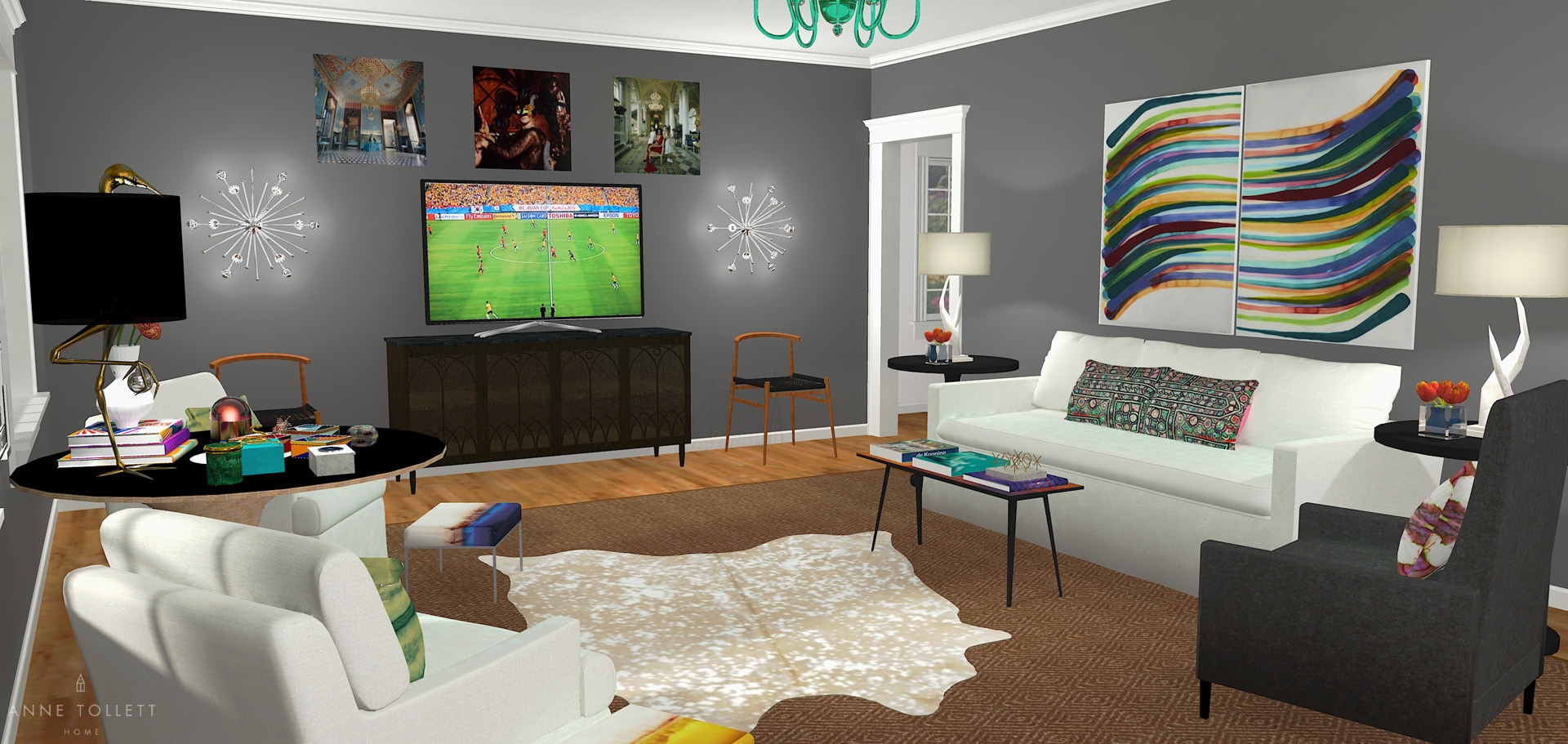
This room is our textile nirvana! We combined different textures throughout the space to draw attention away from the TV – no matter where you look, there’s something unexpected to keep the eye moving away from that gigantic black rectangle!

We wanted the room to feel strong enough for him to have the guys over but soft enough for her to hang with the ladies (kinda sounds like a deodorant commercial, huh?) To that end, we chose a dynamic scheme with furniture that had both masculine and feminine lines.

Strong finishes like the cowhide rug are tempered with silver flecks, while masculine plywood discs are stacked in a feminine shape to create a table. It’s this balance of tough and soft that keeps the room feeling dynamic and appealing to both sexes.

The room is a complex mixture of textures and patterns, but by keeping the foundational palette calm, it allows for visual dimension without overwhelming the space. Look closely–all the key pieces of furniture are white, gray, black or wood! In a few weeks, we’ll show you how to completely transform this room’s vibe by altering only the accessories. A trick that can easily be accomplished because the key pieces are so neutral! *design magic*

The Paint
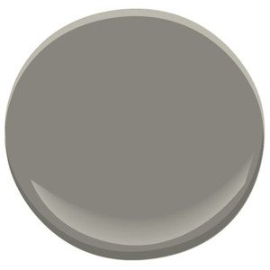
Just at a glance, you can tell there’s a lot going on in this room. To balance the furniture, fabrics and accessories, we went with Benjamin Moore’s Chelsea Gray (HC-168) in a “washable” flat finish. A deep and warm gray, this paint offers a beautiful and dramatic backdrop to the intricate textures and finishes. Plus, it can play supporting actor in the space while still lending a distinct personality all its own! The trim is our old standard: Benjamin Moore’s Decorator’s White (CC-20) in semi-gloss finish.

The Furniture
First, we made sure to put enough seating in the space for loads of people to pile in for the Super Bowl or the Oscars. The large sofa and recliner offer space to flop and relax, while two clean-lined armchairs (that swivel!) mean there’s never a bad seat in the house.

The graphic ottomans are both a stylish place to put feet up and serve as extra seating. We carefully selected additional side chairs with lean profiles to take up minimal space while providing four more chic spots for people to sit and enjoy this room. Bonus: the bench cushion on the sofa ensures no one is “stuck in the crack” when three or more people pile on to watch the World Cup!

Let’s talk about that round table! Its wow-worthy curved and stacked design steals thunder away from the TV, while the wooden sideboard, coffee table and console bring the room back down to earth with simple, clean lines.

Normally, we’re not huge fans of recliners, but this one is fabulous. With topstitch detailing and a slender profile, it’s universally appealing to both men and women. Covering it in a deep gray fabric makes it forgiving if people kick back with their shoes on, plus the charcoal gray looks fab with the walls.
The Accessories
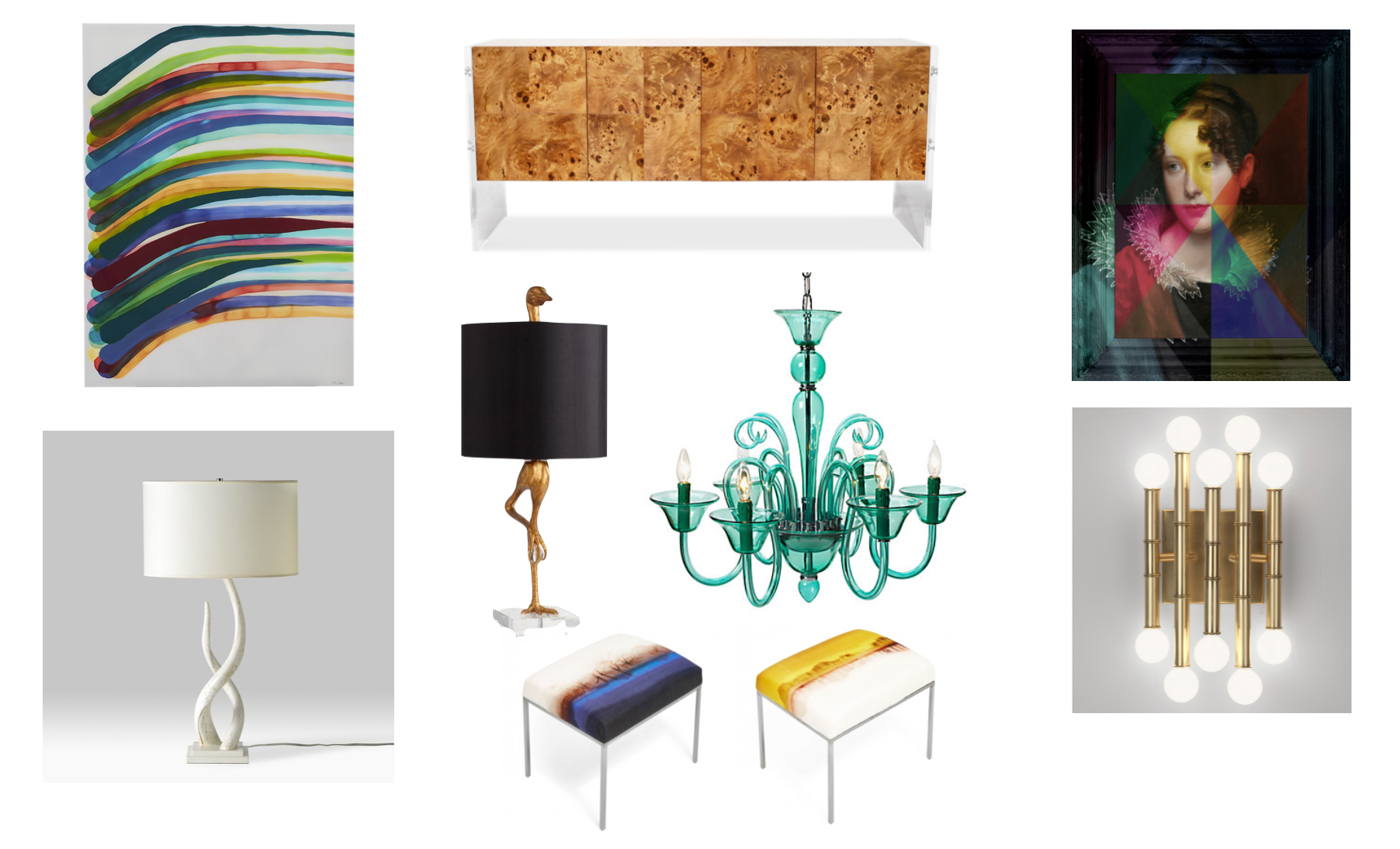
We can’t deal with how much we love these accessories! Combining, clashing, and fusing a range of styles makes this room unforgettable.

Classic profiles and styles are channeled through the traditional lines of the mirror and chandelier, while artwork above the sideboard offers and unexpected twists on a traditional theme. (Seriously, look at that portrait!) The fabulous owner of Nest in Dallas, Texas pointed me in the direction of this little lovely, and I know he’ll want to make it yours!


To reinforce masculinity in the space, we used animal influences in the wooden horses, table lamps and cowhide rug, yet balanced them with feminine floral touches and hits of pink.

The Layout
It’s no secret now, there’s a lot going on in this room! So how do we make all of these elements work together? There’s no way we could make sense of all the chaos in this space without grounding it symmetrically through both color and number.

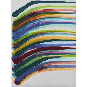
The symmetry is seen in the pairings of the side chairs, armchairs, end tables, and lamps, while the round tables, recliner and bird lamp anchor the space and all echo black and dark hues like the TV. The console and sideboard, through different in finish, establish geometry through similar rectangular silhouettes positioned across from each other, and this geometry is furthered in the repeat of the sconces. By keeping these themes in mind, out-of-this-world pieces like the wall art, crazy round table and colorful chandelier can all make their own statements without seeming overbearing because the ‘eye can rest’ in the symmetry.
Make It Your Own
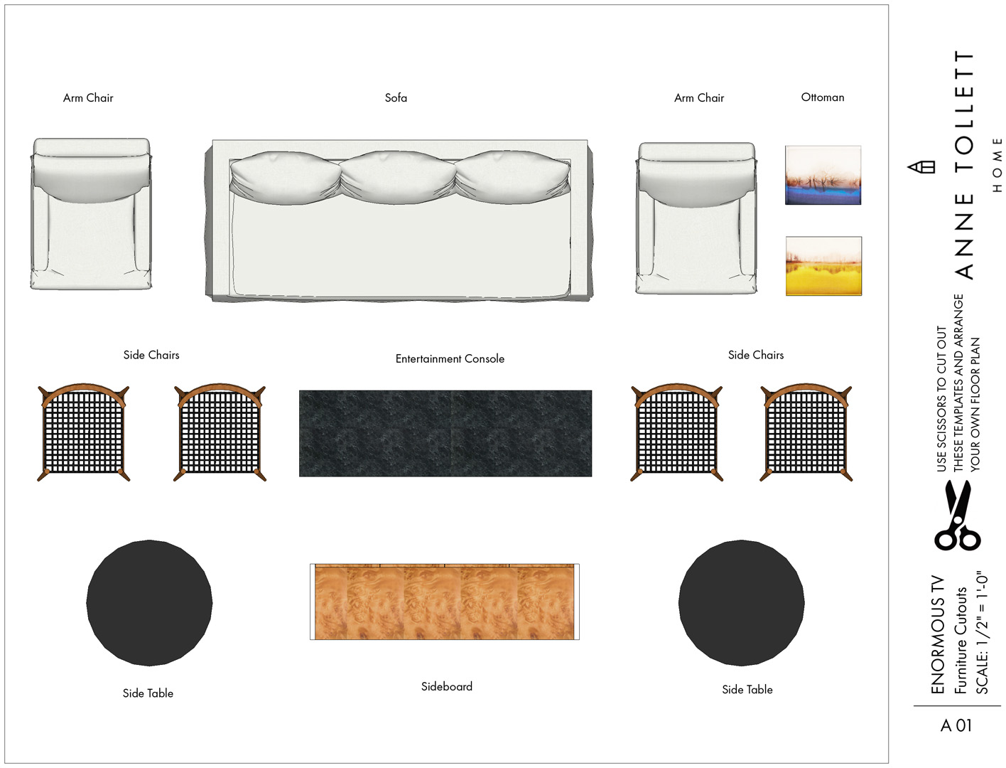
Our biggest wish is that you get to experience the thrill of designing gorgeous rooms without the worry of design missteps. We all want a pretty house that reflects who we are and how we love to live – now it’s so easy. The floor plan in your house will likely be different from the one pictured here. That’s not a problem! You can reconfigure everything from the Enormous TV Room in your own space. Our Design Guide and Buying Guide outline how to easily recreate this room in your own home.
At last, you can stop making costly design mistakes!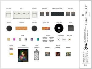
Here is a rendering just for you, a scaled printable floor plan with elevations, and a buying guide of where you can buy every item in this room. So the next time someone you love want to buy a TV as big as a bed, you will know exactly what to do!
Happy Shopping!
xoxo
Anne
