Let’s stroll down an imaginary path of designing a room with Mary and see how tricky this trail can be.
If you can relate at all to Mary, hurrah! We promise you are now on the road to creating flawless rooms of your own!
Mary loves to make her rooms beautiful and devours interior design magazines, blogs, TV shows, and websites. She would describe her taste as traditional with an eclectic and global flair, and she’s on the hunt for her new living room.
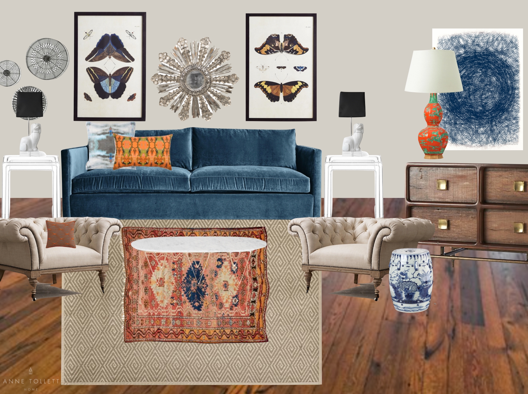
After searching endlessly online and in stores, Mary creates a mood board/Pinterest board of everything that reflects her style. Her vision is starting to come to life!
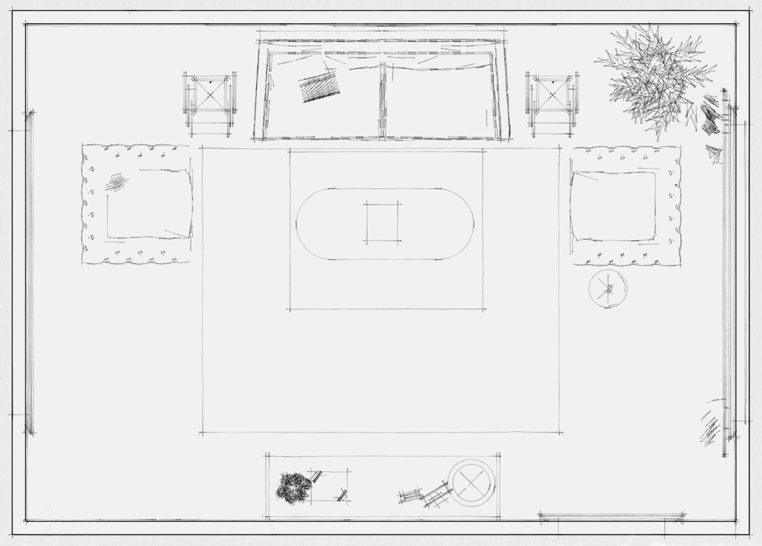
To make sure the pieces from her inspiration boards work in the room, she sketches a floor plan and sees that it all fits perfectly.


Feeling a sense of accomplishment and pride, she buys everything that she searched so hard to find.
Her endless hours of careful work and hunting seem to be time well spent, and Mary heads to dinner with her best friends to tell them how excited she is.
Delivery day arrives! Everything is installed exactly as Mary planned, but for some reason, something just doesn’t seem “right”.
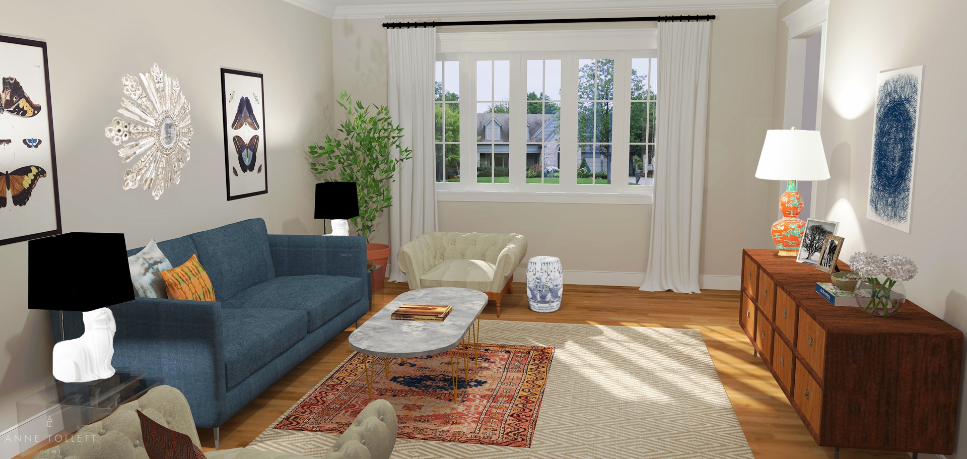


She can’t put her finger on why she doesn’t love her living room, but she knows it doesn’t look as polished as the rooms from her dog-eared design magazines and pinned inspiration boards.
How can a space Mary invested so much time and hard work into not turn out exactly the way she envisioned, especially when she thought she had it all figured out? She feels confused and defeated. She wishes she could recapture the time and money she wasted. What went wrong?
Let’s look at this a different way.
What can we do to ensure Mary never makes these costly design missteps again?
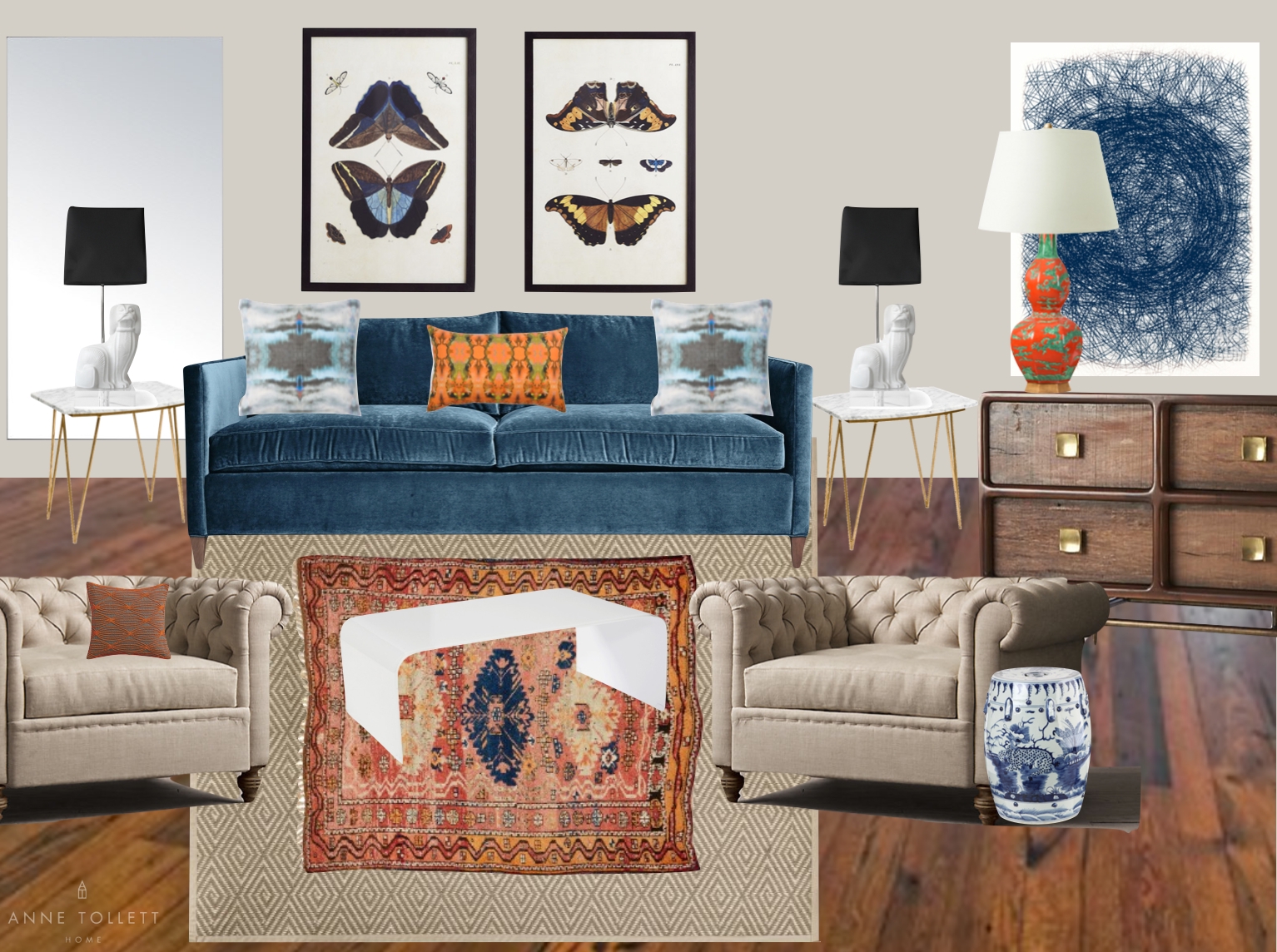
Above is Mary’s mood board, and below is a mood board that has been carefully curated for the same room by a seasoned interior designer. At a glance, they look very similar.



They even look almost identical in planview sketches of the room, too! Mary’s is above and a designer’s plan is below.


But let’s see the differences in these two rooms in reality. Again, Mary’s room is above and the room below has been curated by an interior designer.


What a difference just a few details can make!
First, hats off to Mary–the pieces she chose for this room are wonderful. The only problem is that the pieces just aren’t wonderful together, and it’s in looking at the subtleties between them where we can fully understand why.
Here’s what we fixed in the space:


Scale and Proportion
We love the chairs Mary picked for the living room, but their low seat height and slightly flared arms made the garden stool and sofa seem disproportionate. We replaced them with larger chairs that are the style she loves, but they have a “boxier” profile to echo the lines of the sofa.
Mary’s blue art, though interesting, feels unimportant, so we bought a bigger size of the same piece and framed it for a commanding and proportional appearance. We also pulled the two butterfly prints closer together to avoid negative space and increased the size of the rug to achieve the same effect.
See how small and subtle fixes can make a huge difference?


Texture
Mary definitely knows how to mix textures–she just needed a little help figuring out how to emphasize them!
The tables she chose are an interesting marble and acrylic story (and they look so good mixed with the velvet sofa and linen chairs), but once in the room, the marble coffee table seems clunky and the lucite side tables seem slight. So we just switched them–now the lucite coffee table becomes an elegant and modern focal piece, while the marble side tables add pretty and proportional function to the room. The correct size of these end tables ensures the whimsical foo dog lamps are at the right height for the sofa.
And the indoor plant? We said goodbye to the typical ficus and replaced it with a colorful fruit tree – always try to buy unique plants if you can. They become conversation pieces and are a welcomed and unexpected twist in a room!
The foo dog lamps are phenomenal with clear lucite bases. We introduced another hit of lucite by adding an obelisk filled with orange butterflies across the room. And by removing the lucite end tables and replacing them with a lucite table in center of the room, we solved the common mistake of putting similar materials next to one another. Lucite lamp bases placed on lucite or glass tables are a design don’t, but lucite bases on marble (or most other materials) are a design do!


Styling
Our final touches came through nuanced styling details and balance.
The pieces Mary arranged on the console are what we typically see: a book, maybe a bowl and a picture frame or two. For us, that’s a little too expected and does nothing for the room. The console is long enough that it can handle the power of the bold lamp along with other strong accessories. We added a tall obelisk with butterflies (a little nod to the prints across the room) and a sculptural orchid (with petals that could almost be the wings of butterflies) to lend a sense of symmetry on either end.
Instead of one coffee table book on the coffee table, we selected many. We even added a large color plate book for the console. Books are inexpensive and smart additions to any room! They are pretty and usable art; they add color, texture, and are conversation pieces.
We also rearranged the pillows. We love what Mary picked, but we wanted to emphasize the pairings in the room (the pair of lamps, the pair of end tables, the pair of arm chairs, the pair of butterfly prints) so we put two of the blue pillows at each end of the sofa with the orange one in the center – a timeless way to show off those artistic gems on the velvet sofa.
Remember, it’s the seemingly insignificant things like these that give a room a finished and effortless quality despite all of the careful consideration!


The Walls
Lastly, let’s look at the room from the perspective of wall elevations because this is where so many common missteps can be avoided!
Placing art at the correct height is quite literally a “fine art”. A common mistake is hanging it too high. We lowered Mary’s butterfly prints and edited the grouping by removing the round mirror – though lovely, it competed with the prints and would be best used elsewhere in her house.
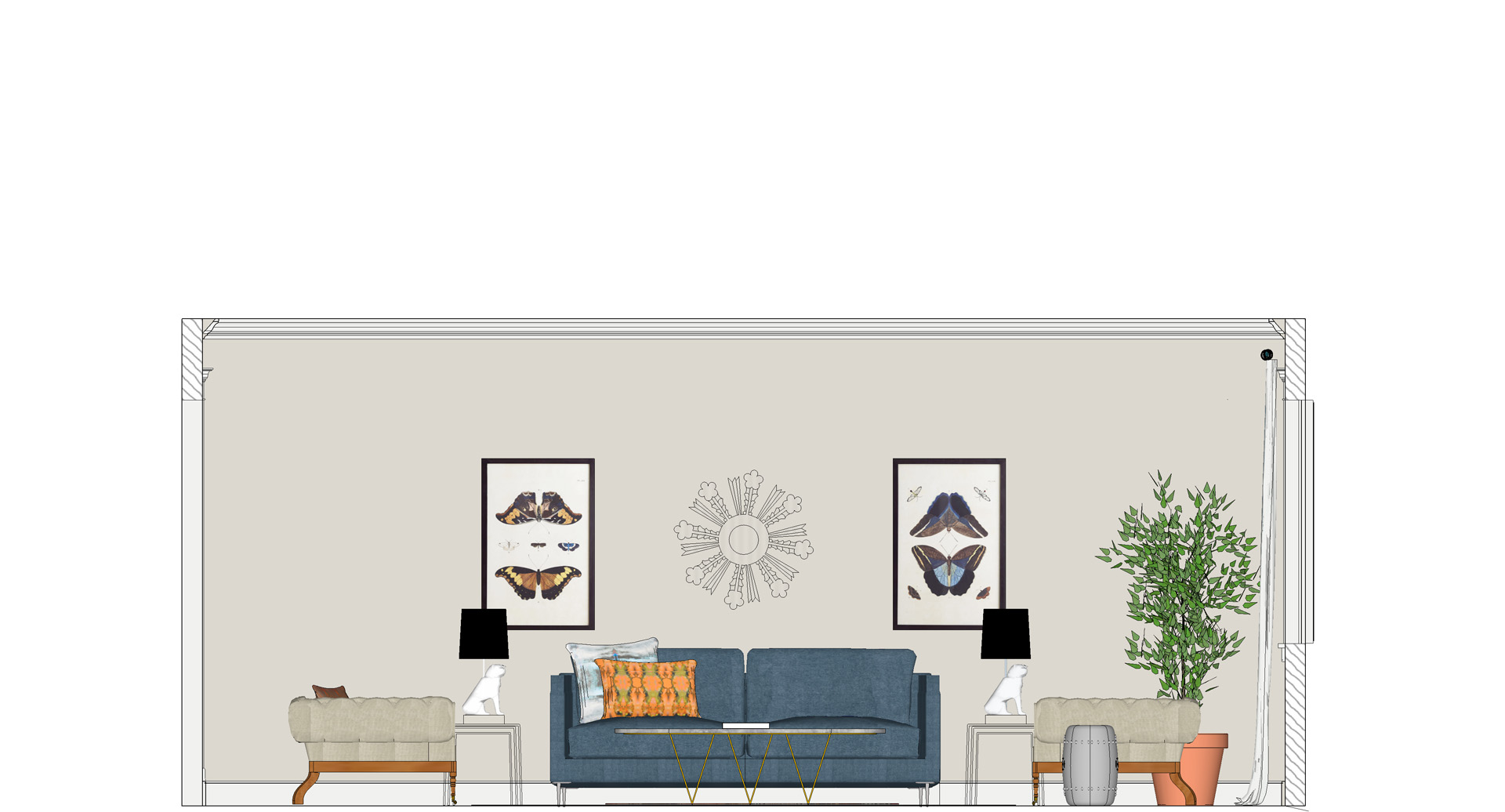


Mary wanted to create a subtle circle motif by reflecting the globally inspired mirror with ethnic looking sculptural circles on the opposite wall. While this seems like a good plan, the result looks heavy handed.
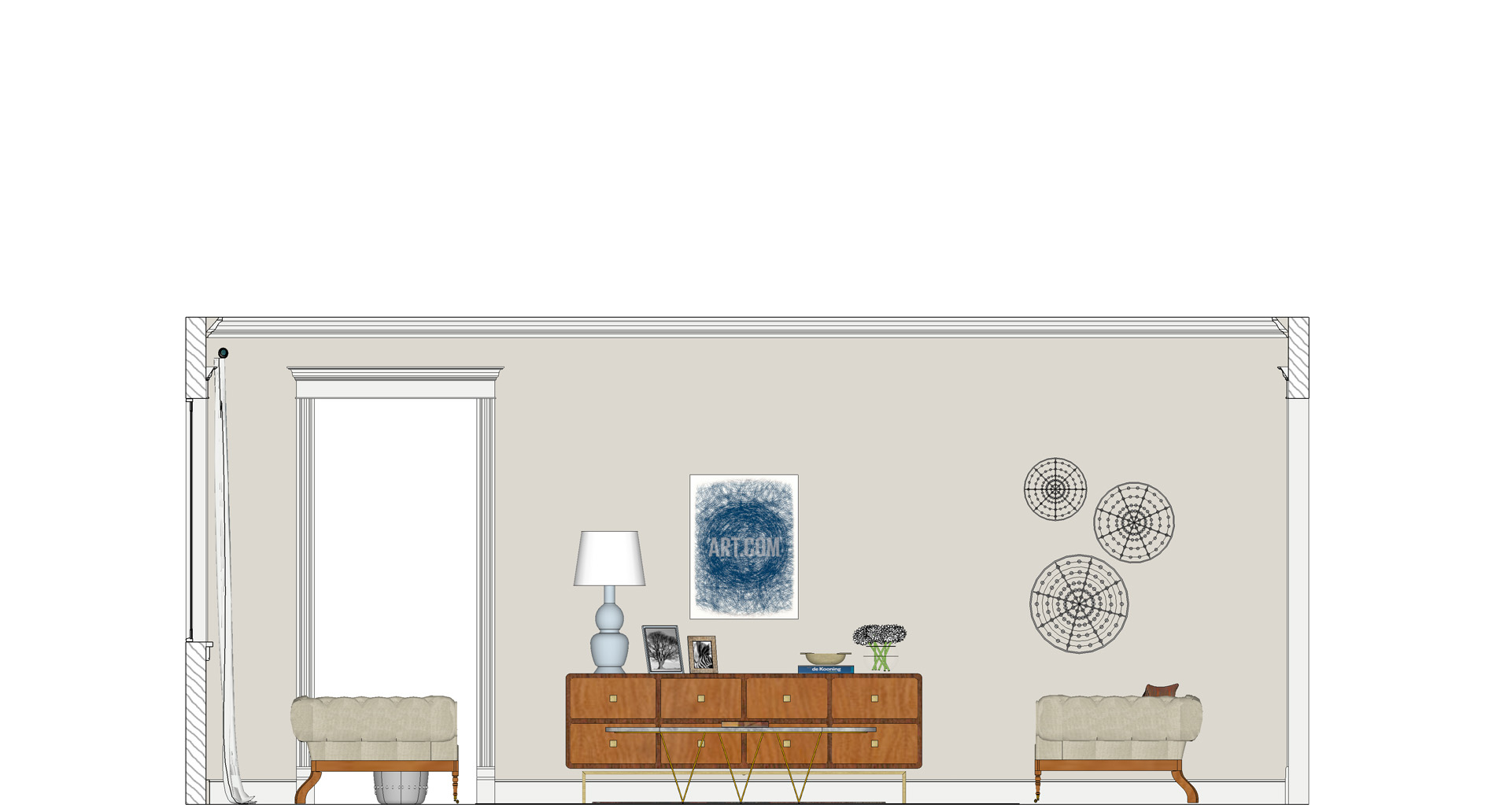

We omitted these sculptural circles, and in its place we hung an oversized rectangular mirror on the wall at the precise height (level with the opening of the door). This creates the illusion of another door and solves the problem of what otherwise is an unbalanced wall.
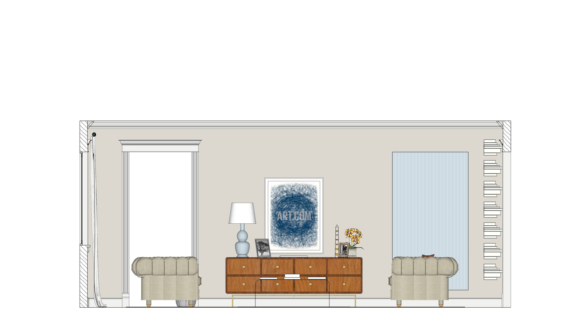

For a final touch we floated books along the main opening of the room. This not only warms the walls, it creates texture and interest while echoing the curtain panels on the opposite end of the room.
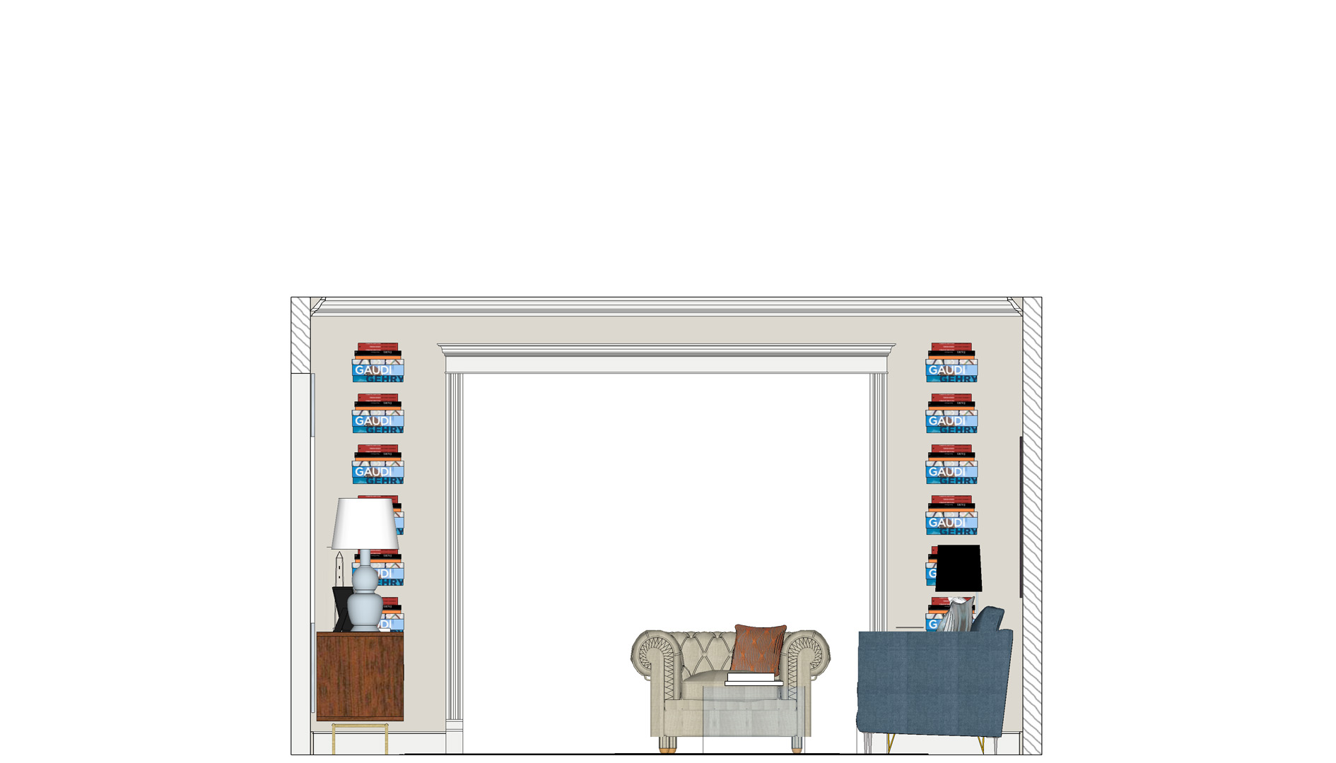

One side note: like so many, Mary was not able to change the color of her walls because she rents this house. We would have suggested a deeper and warmer french gray to add drama, but the color of her walls is still lovely, and Mary made great choices to complement what she had to work with!
This entire exercise is to show you the importance of scale, silhouette, texture, proportion and styling when designing a room, and that careful design considerations are critical to making spaces look stunning and effortless.
At Anne Tollett Home, we help you make flawless rooms within your own four walls without any more costly design mistakes.
More importantly, we want you to learn to recognize when a mood board or other collection of things you love only looks pretty on paper or on a screen!
We’ll show you the what, how, and why behind beautiful rooms so you can recreate them in your own home. This knowledge, along with detailed designs and shopping guides, will give you the perks of an interior designer without paying the cost.
We all want to experience the thrill of making beautiful spaces without the frustrations of expensive design mistakes – welcome to Anne Tollett Home.
We’re so happy you are here!
Xoxo
Anne
