THE SPACE
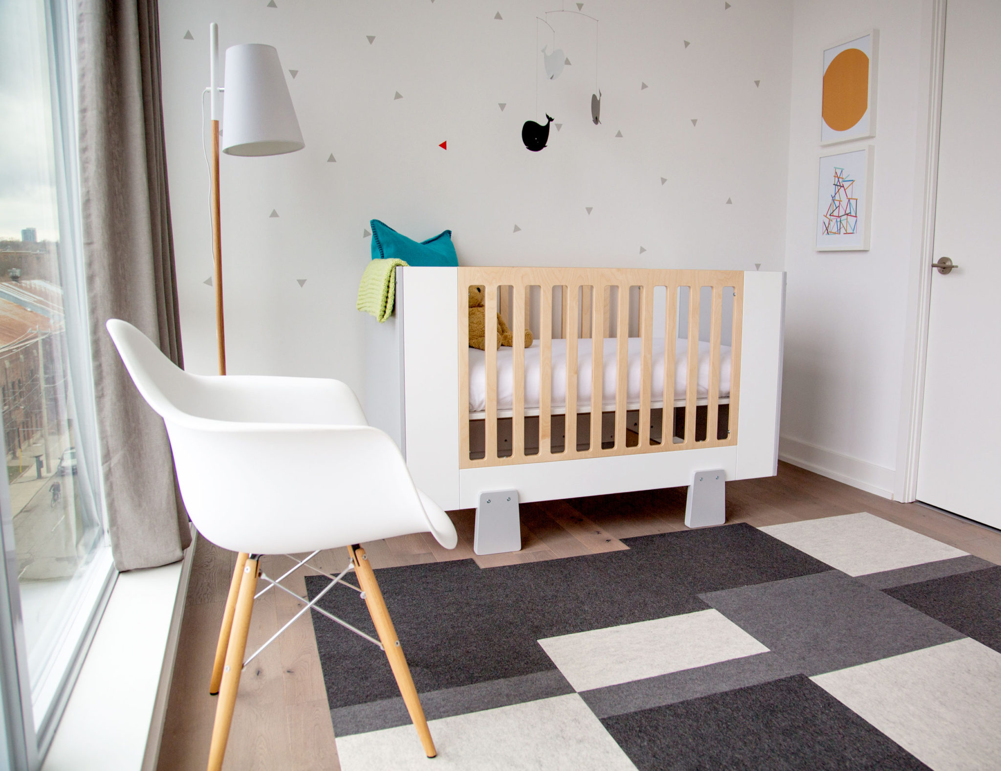
Sometimes you just see a person and think, “That girl is going to be a star!” We found Ashley Freeman when she’d been on Instagram for five seconds, and knew we had to bring her onto Hanover Avenue! She is thoughtful, and funny, and creative, and smart, and fabulous on film (check out her YouTube Channel!), and she’s A CANADIAN (whoop, for our first international designer!) Simply put, we love her and know you will too! We’ve got a medium-large amount of dough on the table as an office bet that this girl becomes a super star! She is a new mommy with a talented husband, and she wanted to share her son Jonah’s room with all of you. Grab some snacks and enjoy this one, lovely readers!

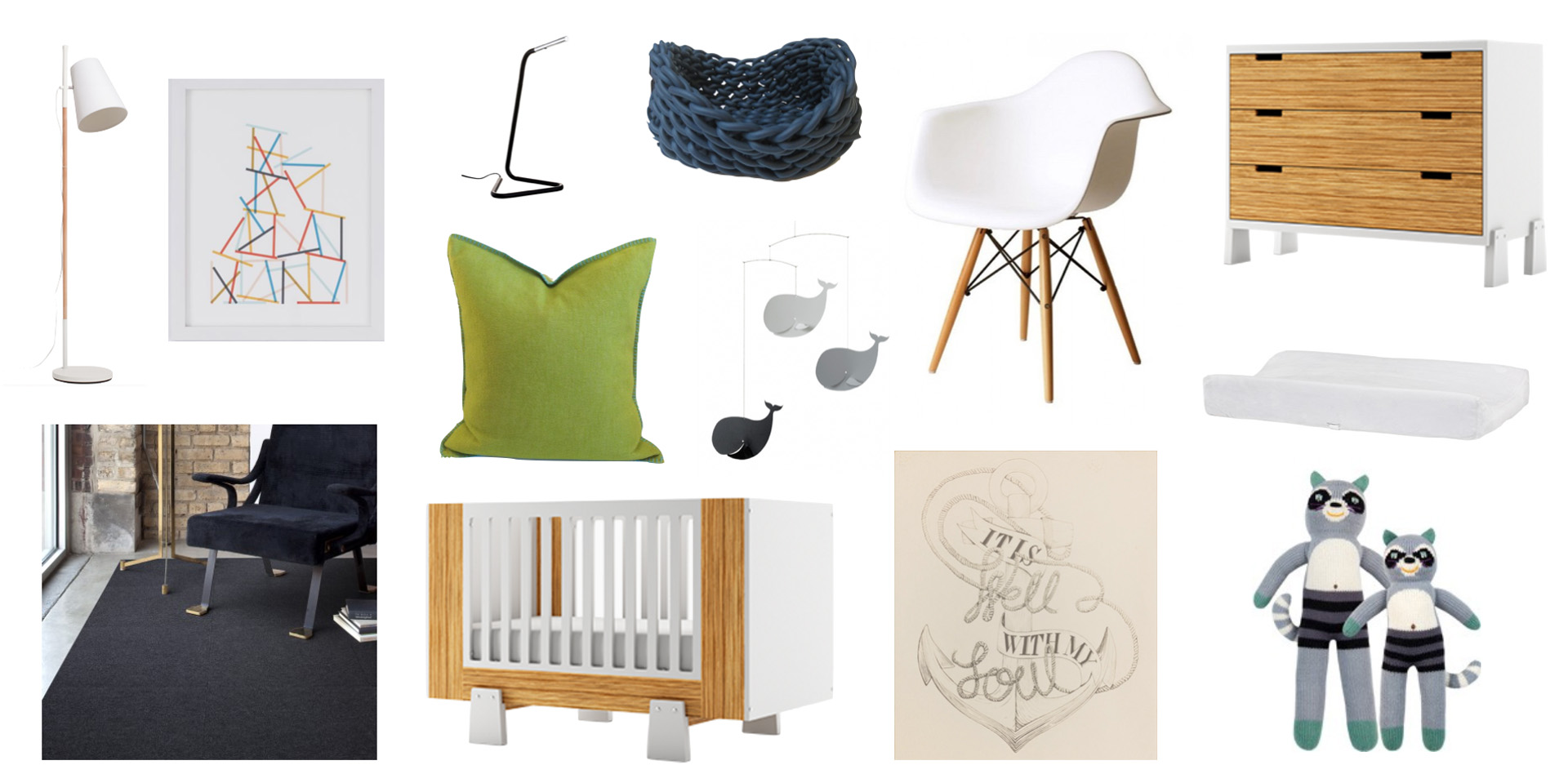
SHOP THIS LOOK!
A quick list of what we love!
*And you can click any item below to take you to a detailed shopping list with links to every store!*
BEHIND THE SCENES
Watch these behind-the-scenes videos with Anne and Ashley to get a deeper look into Ashley’s design choices, learn more about her creative process, and find out how you can recreate this look for your own precious peanut!
Bloopers and Outtakes!
5 TIPS ON HOW TO GET THIS LOOK
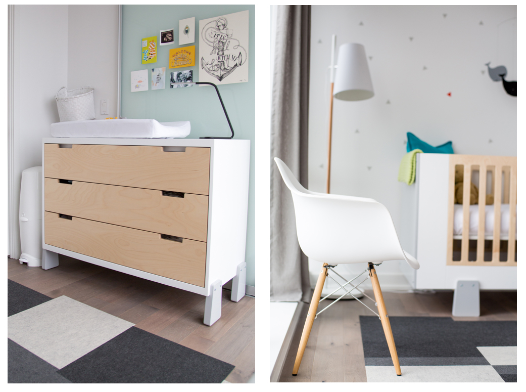
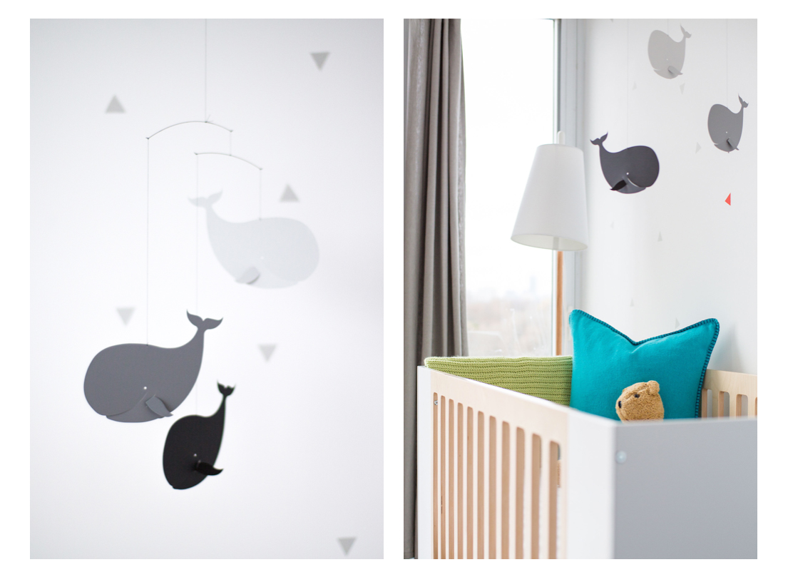
1. Add natural wood to warm a monochromatic room. So often modern rooms (especially nurseries!) can feel stark; because the lines are so clean and the whites are so pure, it can go antiseptic quickly. Ashley added pieces that have blonde wood which warms the room right up without taking anything away from the fresh modern profiles!
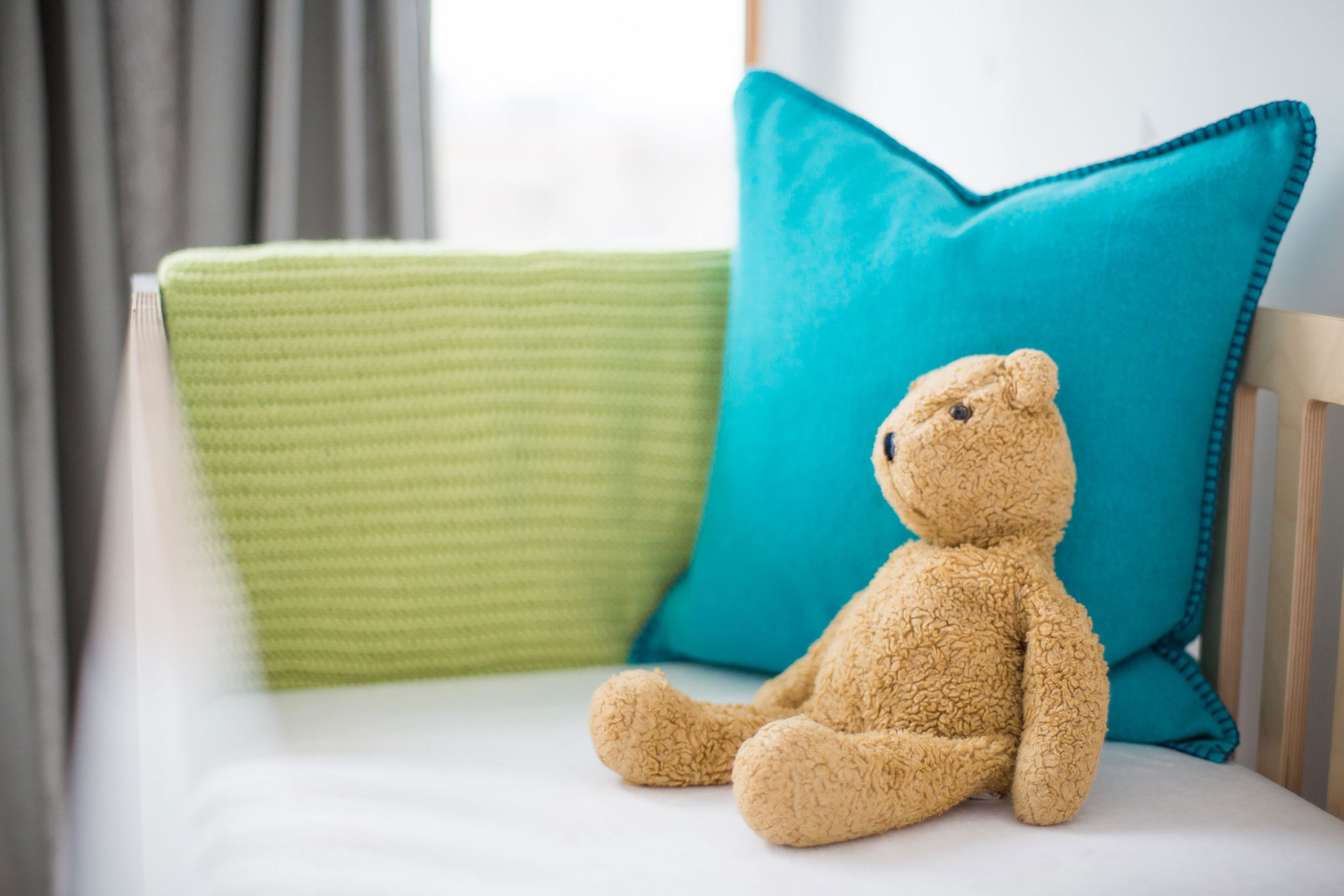
2. Adding a family heirloom, something vintage, or an antique creates charm…Oh, hey there, Teddy Bear! By just bringing in this one well loved toy, the room suddenly feels less “new”, less “off the rack”…. This is how you make a space feel like it evolved over time!
3. Don’t buy the nursery “in a box” or “theme room”. Nothing says, “I only know how to paint by number” more than kids’ rooms that come out of one bag from a big box store! Ladybug lamp meets ladybug sheets meets ladybug wallpaper and rug. Bleh! Though Ashley used a matching crib and dresser, she brings in other elements that are similar but different: the chair that echoes the crib, the lighting, the geometric rug. She also creates personal touches with the wall art and the framed art that she made by hand! Adorable!!
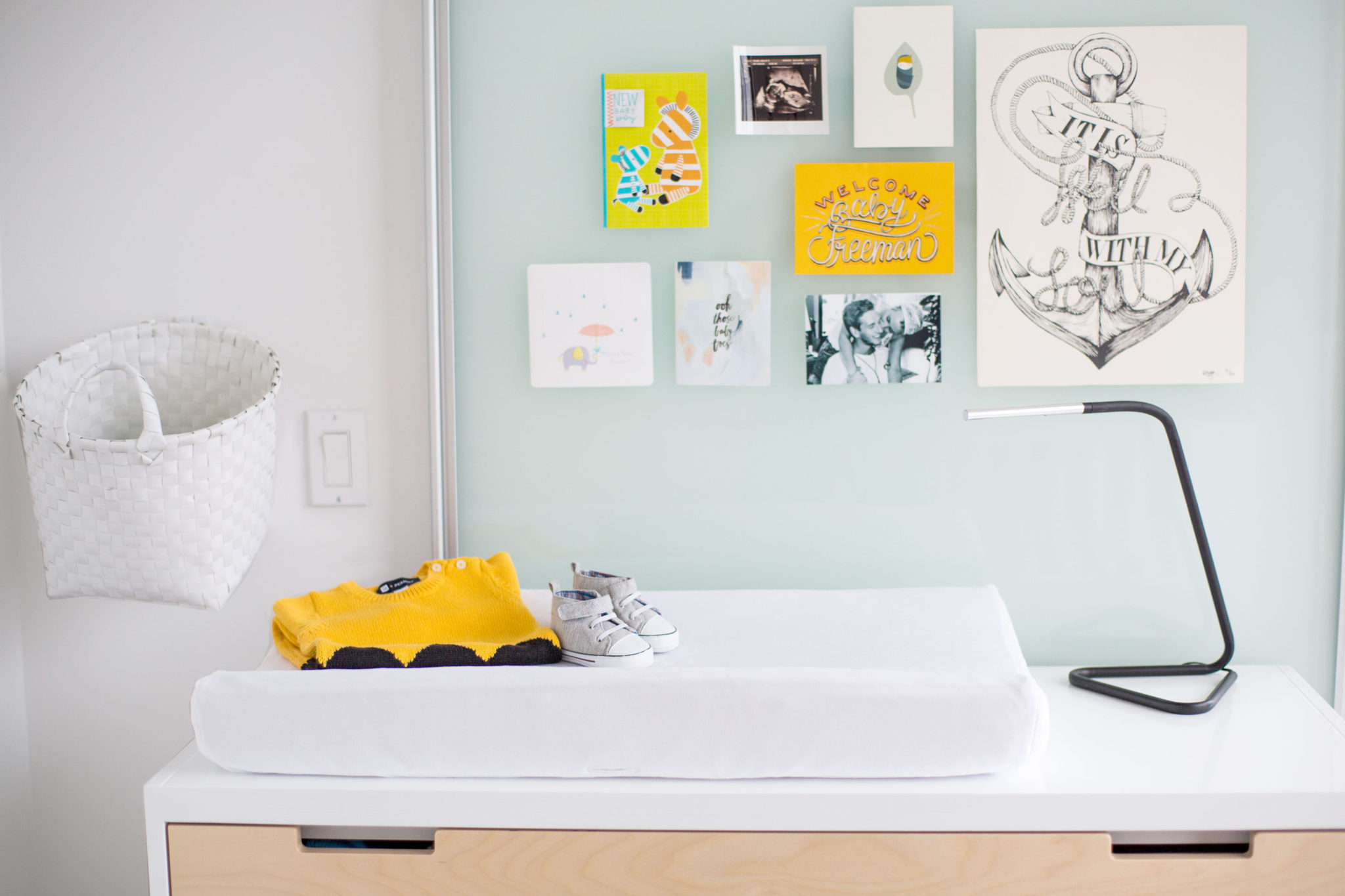
5. Emphasize architectural elements in a room. Ashley used the sliding glass door as a place to hang her art. She almost created an accent wall out of the door! So creative!! She then mirrors the pale turquoise glass of the door in the deep turquoise pillow on the bed. We are blown away!
6. Good design accounts for everyone living in the space. This room needs to be bullet proof because let’s face it, babies are cute but babies are messy! Anyone who has cleaned poop off of their darling’s neck knows what I am talking about! ((high-fives to the mommies of the world!)) We think it’s so smart that Ashley chose a comfy plastic chair that is a cinch to wipe up, durable and washable floor tiles that can be easily replaced if soiled, and super creative task lighting that is chic and functional!
INSIDER SECRETS!
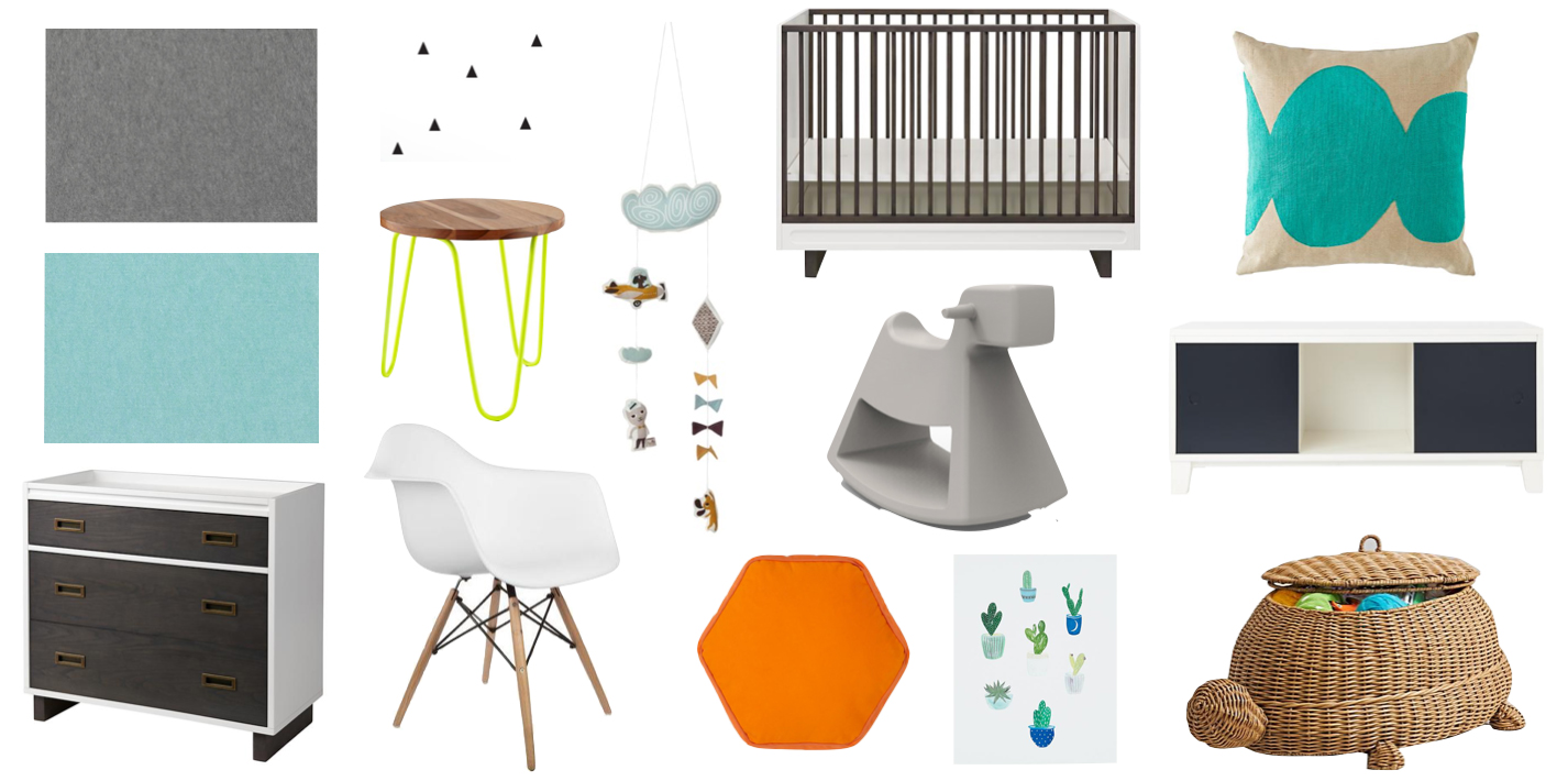
One of our favorite details from Ashley’s nursery has to be the Charlie Brown-esque sweater and little shoes placed on top of her son’s changing table. It reminded us that you don’t always need to buy a new toy or accessory to style out a bedroom – there are tons of hidden treasures folded in drawers and tucked behind closet doors that are yours for the taking! You can place them on a bookshelf or on the top of the table, even hang them on a floor mirror or on the back of a bathroom door for some extra character. The opportunities are endless! Here are a few combinations that we came up with to give you even more inspiration to make it your own:
MAKE IT YOUR OWN
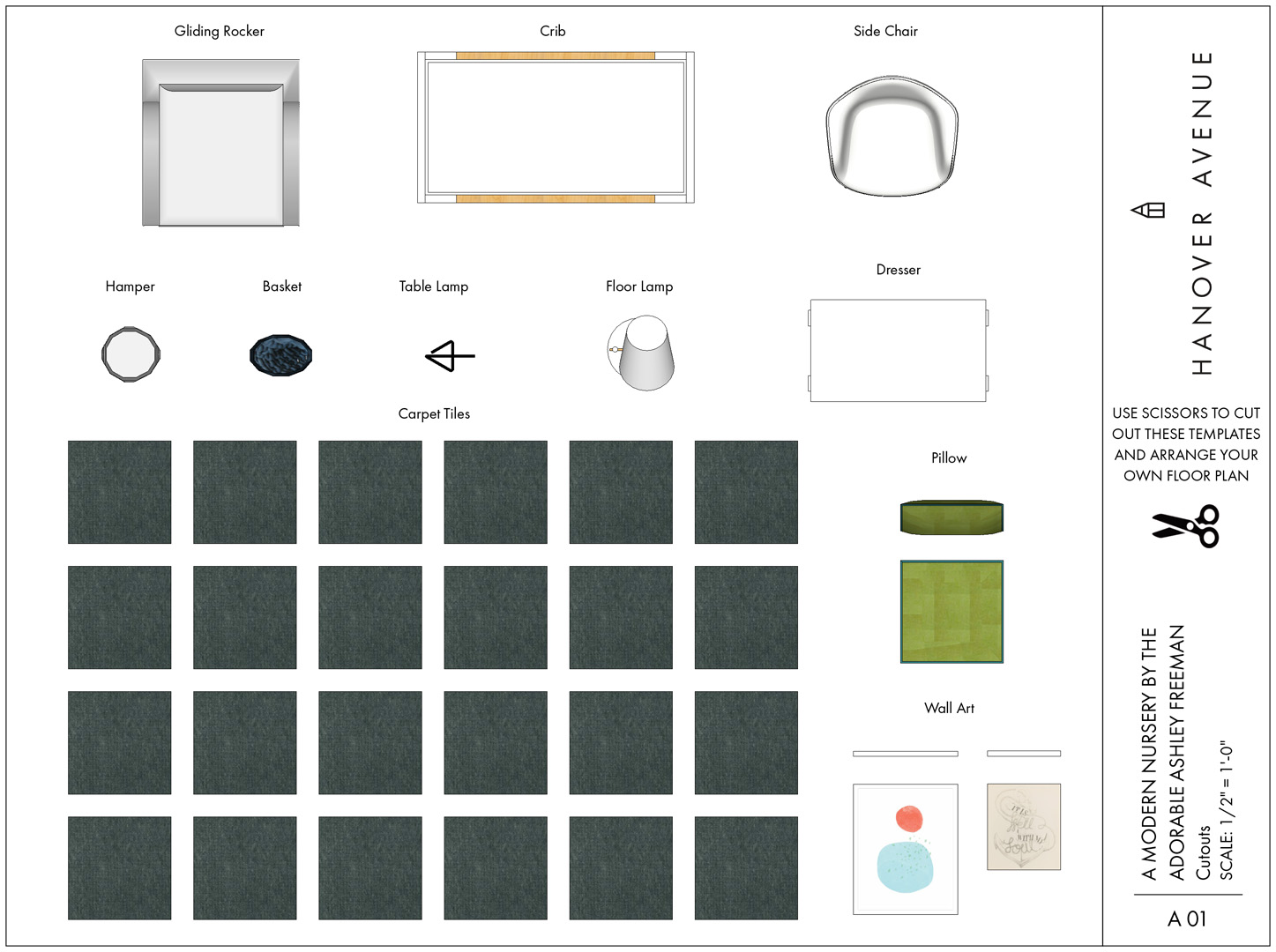
It doesn’t matter if your floorplan is not the same! DESIGN GUIDES with room planners and templates help you get this look in your own house – no matter what your layout! We show you exactly how we do it – It’s So Easy! If you love paper dolls, you will LOVE this!
xoxo
Anne


