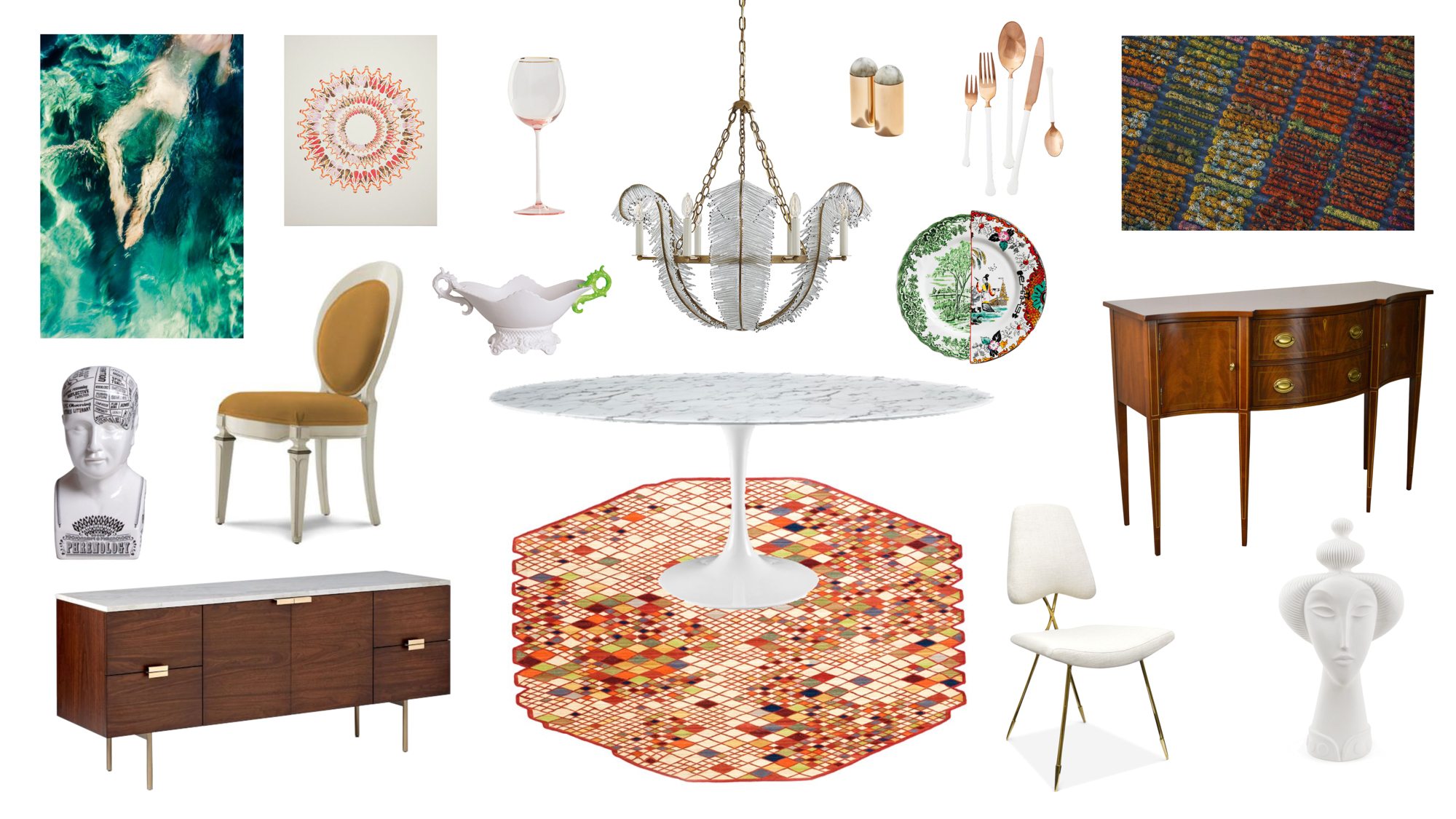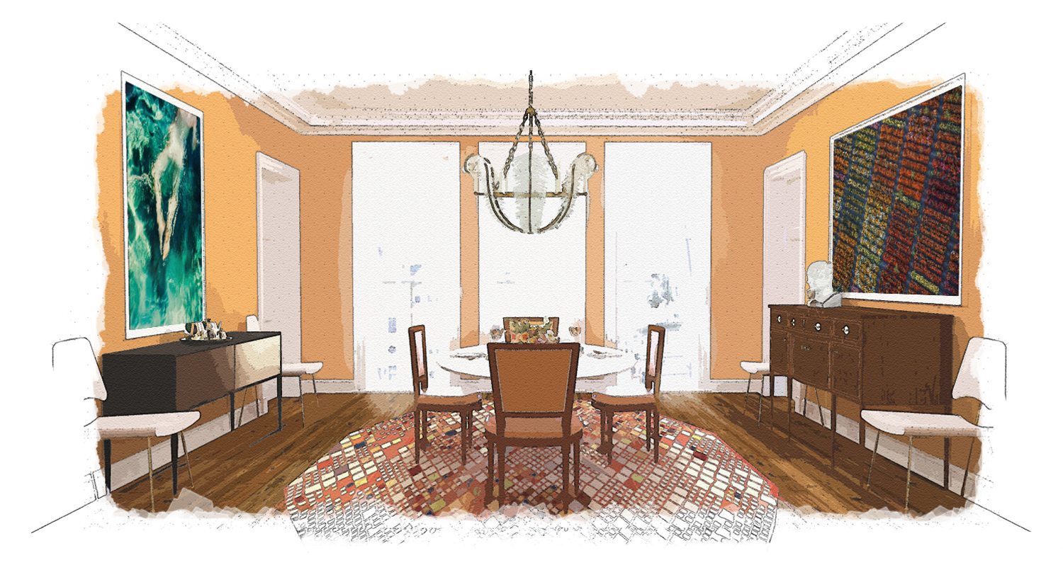
Bam! It’s almost pumpkin season, so lets talk orange! Just how do you use bold color in a room? It’s easy to shy away from intense brights because it can quickly escalate from a fun hue to an overpowering statement, but we promise there is a way to do it right! We’ll take you behind the scenes of a mock up of a European Dining Room that would translate flawlessly to any size space.
Behind the Scenes Design Tips
If you’re daring enough to try bold color, start with the dining room. Since it’s a room without too many upholstered pieces that need to coordinate, the dining room is the perfect safe space to use high chroma with ease. Just take a peek at what we did….
Shop The Look
Love anything you see? We have a detailed BUYING GUIDE of similar pieces from this room so you can easily re-create this look in your own house! Click any image below to shop….
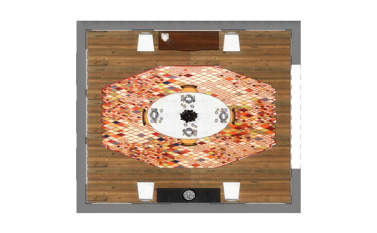
For the furniture, we wanted to combine two distinct movements, so we mixed midcentury modern and classic federal styles. Midcentury modern, which captures furniture silhouettes in their purest essence, makes the perfect pairing with federal pieces because both styles have a distilled elegance. We also loved how the shapes in the art echoed those in the rug, and in turn, how the rug then echoes the geometric vibe of the table. (See how it all comes together?!). As for the chandelier? We went all the way with this one! This phenomenal light fixture is so eye-catching that it can effortlessly hold its own against the bright orange walls.
Insider Secrets
1. Chose the perfect shade of Paint! Our favorite secret weapon, Benjamin Moore’s “Eye of the Tiger”, is the perfect shade of orange paint on the walls because it’s fearless yet not overwhelming – perfect for any homeowner trying bold color for the first time.
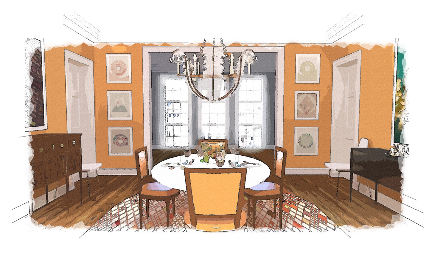
2. Be Fearless and learn your color theory! So how do we decorate a dining room with orange walls? You might be thinking neutrals, right? Nope! Not always! When it comes to high chroma color, a great rule of thumb is to go big or go home. Instead of letting the orange steal the entire spotlight, we supported the hue by choosing art with complementary colors–take a look at our rich mosaic of blues (orange’s best friend and true complement)! The huge art pieces are bold ways to fill the walls, and because of their palette, they add to the room in the best way – by making the orange prettier.
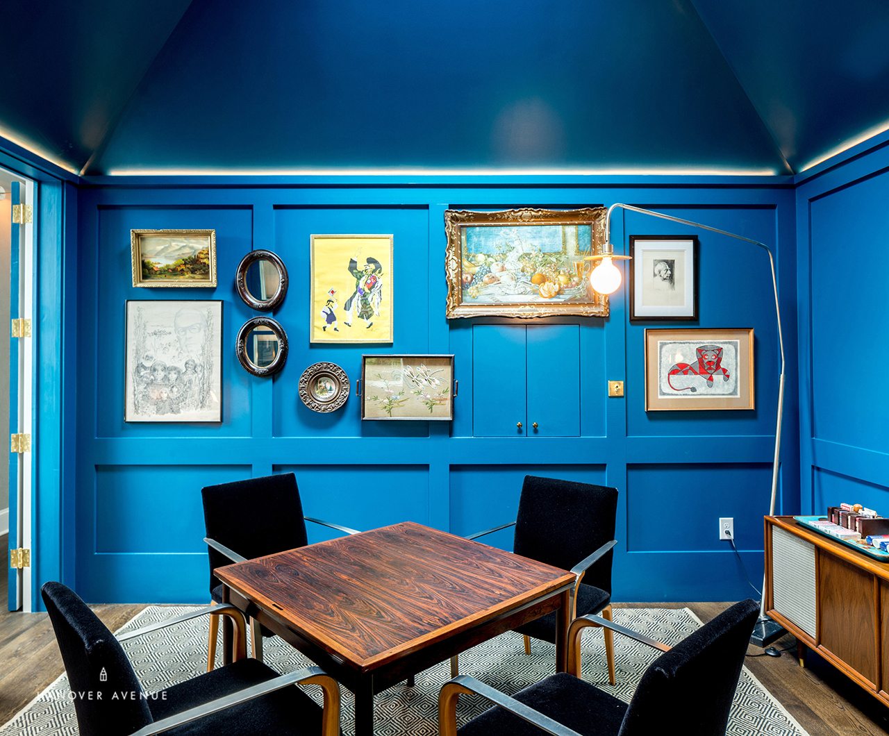
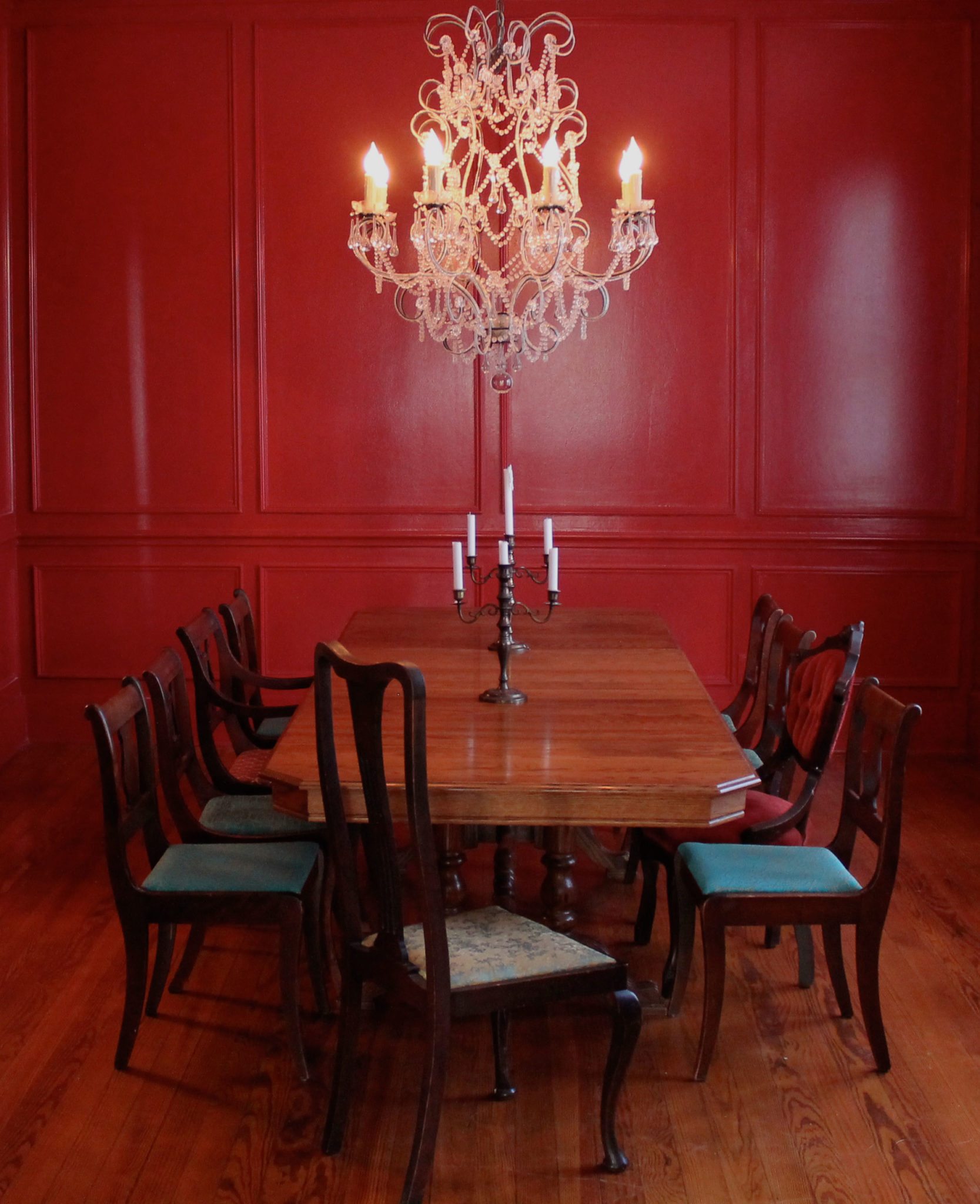
Hanover Avenue Loves to Design Bold Dining Rooms
Check out a few more dining rooms we have designed for clients around the United States. We love it when clients are on board with high chroma walls!
MAKE IT YOUR OWN
Our biggest wish is that you get to experience the thrill of designing flawless rooms without the worry of design missteps. That’s why we have made it so easy to Become Your Own Designer – no matter what your room layout! Just click “Explore This Room” (in upper right corner) to get started:
1. BUYING GUIDES with clickable links to stores of everything you see
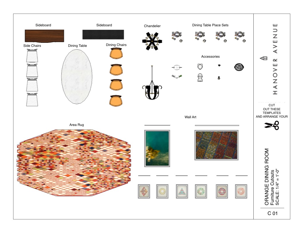
2. DESIGN GUIDES with room planners and templates to get this look in your own floorplan
3. HOW TO VIDEOS and more!
xoxo
Anne
