Behind the Scenes
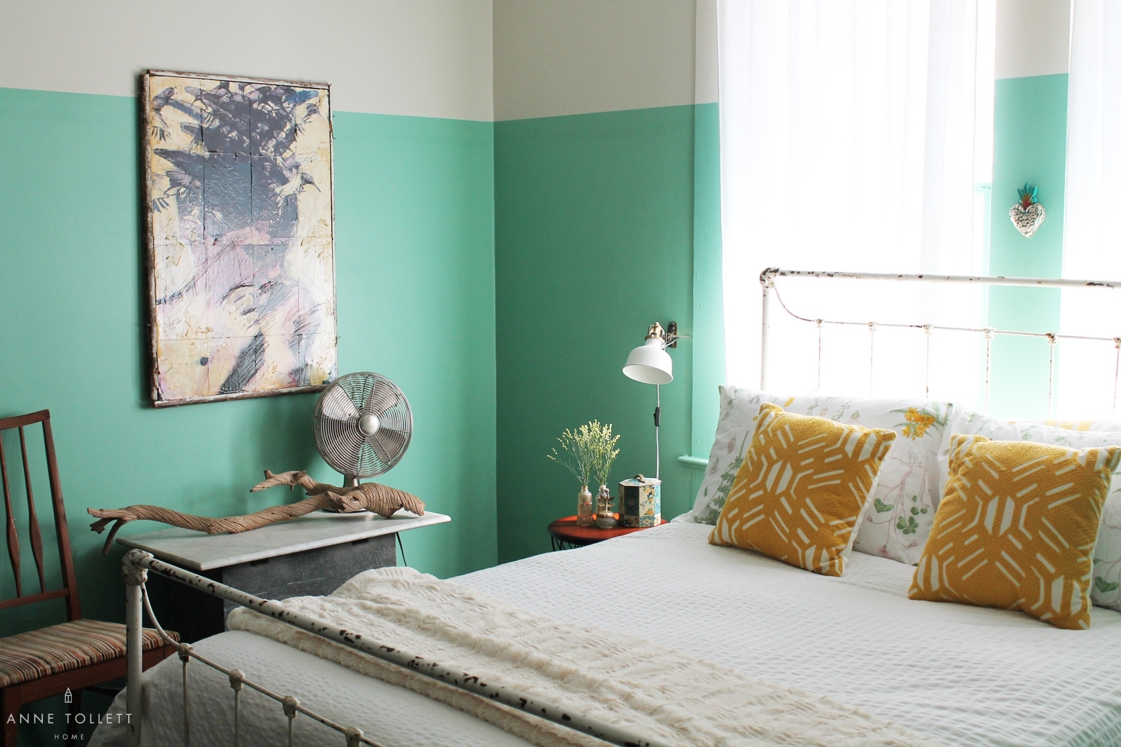
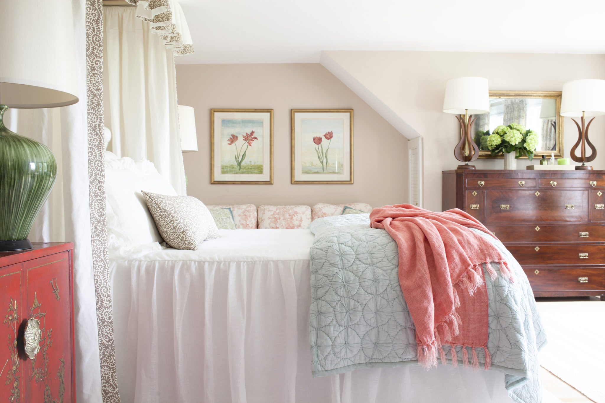
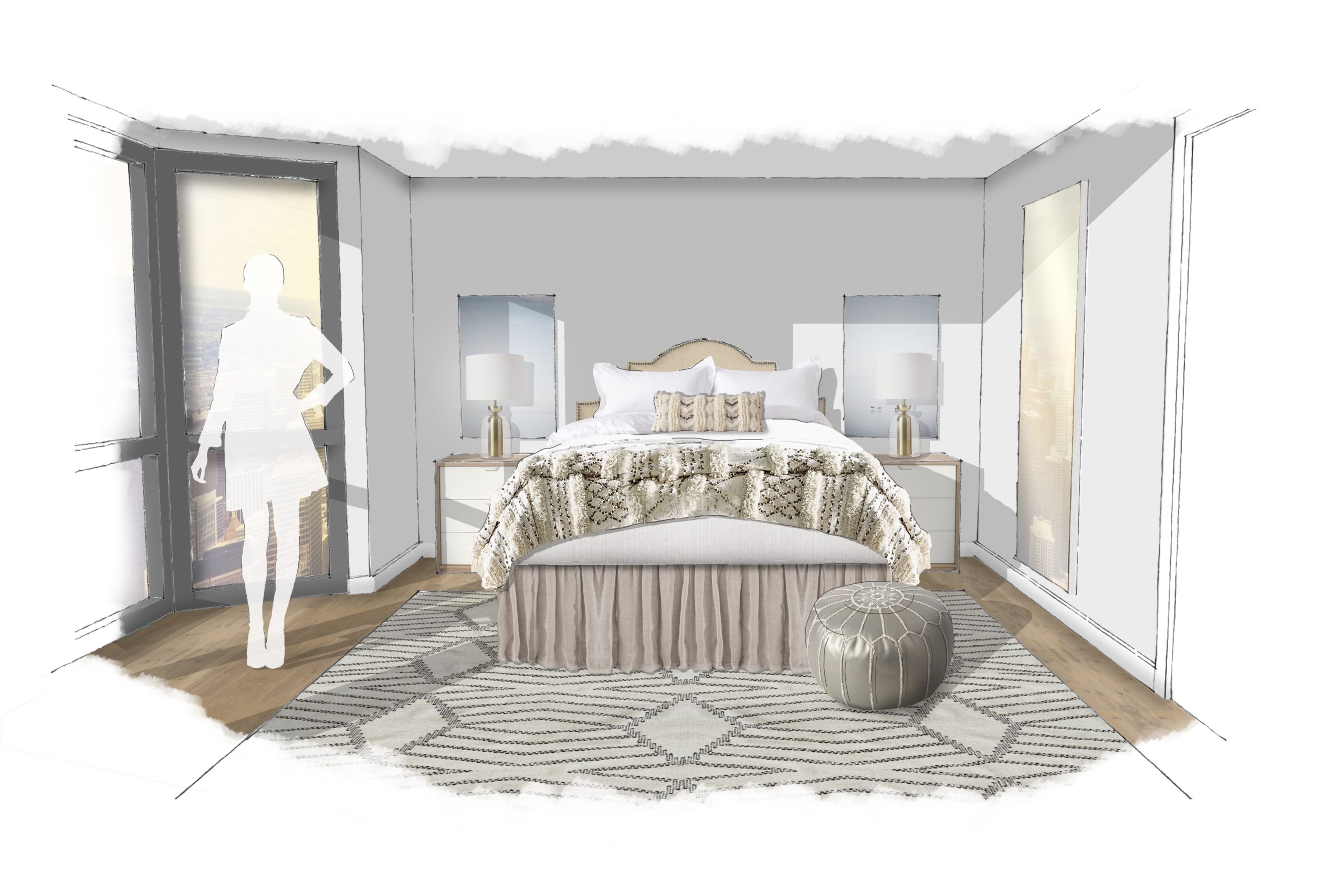
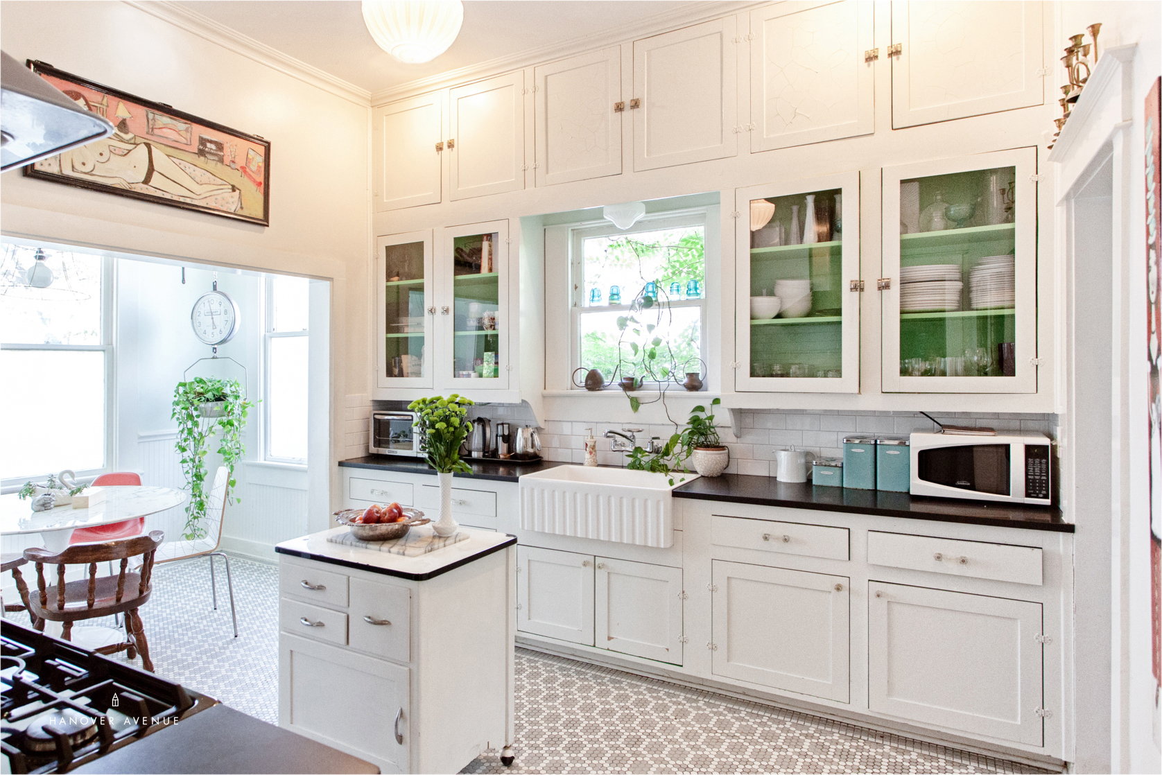
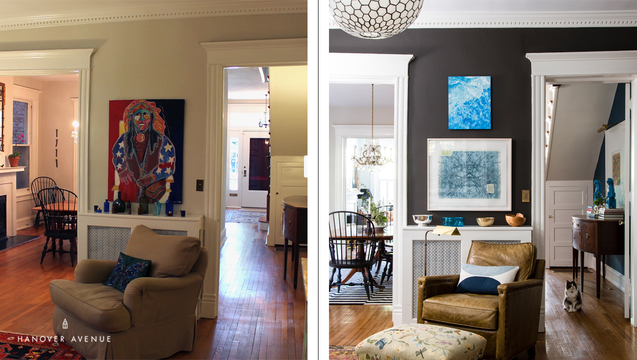
Ok. Full Disclosure. Sometimes Interior Designers want to redo rooms they’ve already designed. There, I said it. We look at our work, suddenly want to tweak it, and paint is the fastest and easiest way to transform a space. It’s big impact on a small budget, and often the furnishings don’t even need to change. Here are some real-life examples of work I have done over the years with Before & After paint changes….get ready!
4 Insider Secrets
1. Go Deep!
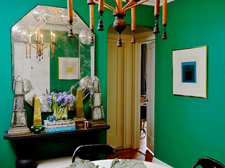
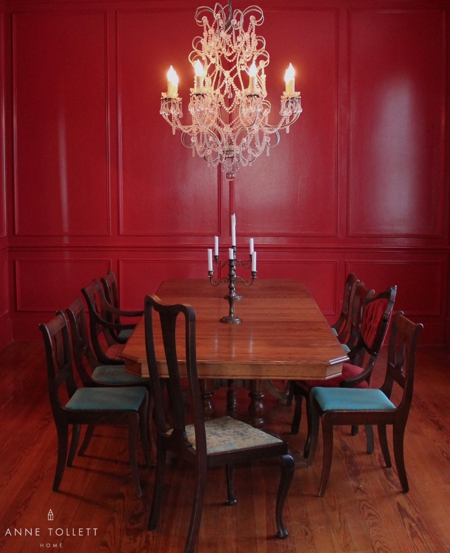
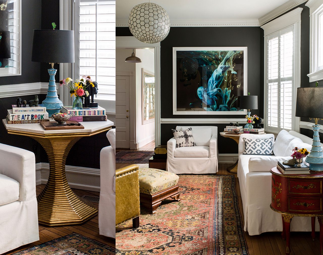
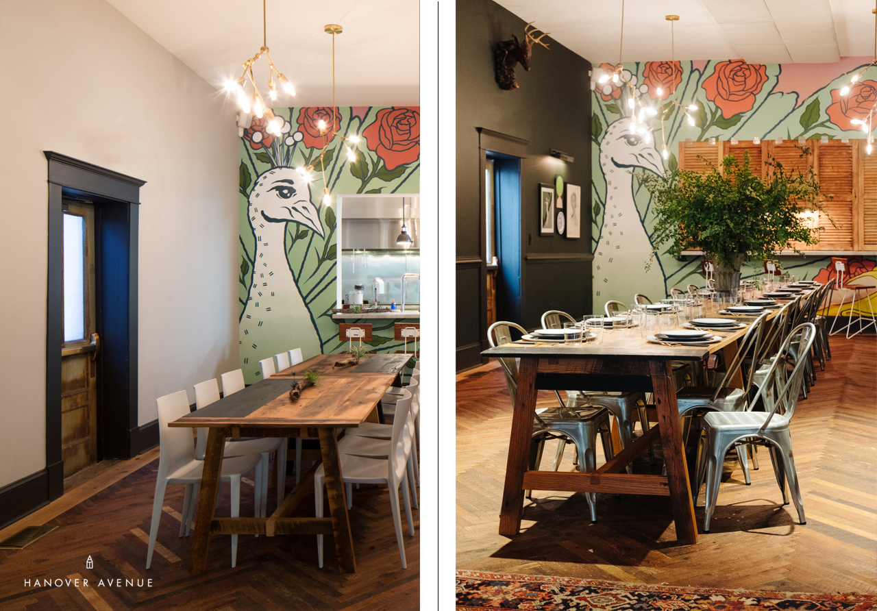
I find when I want to use a dark hue on the wall, I always need to go deeper than one would think. It seems counter intuitive, but “go big or go home” because if you wimp out and chose the lighter half-tone, it ends up looking half-hearted. In both of these spaces (above and below), we chose paint that was nearing black. The rich black brown from this project is Sherwin Williams “Black Fox” and the yummy deep green in Common House is Farrow & Ball “Studio Green”.
2. Create your own color.
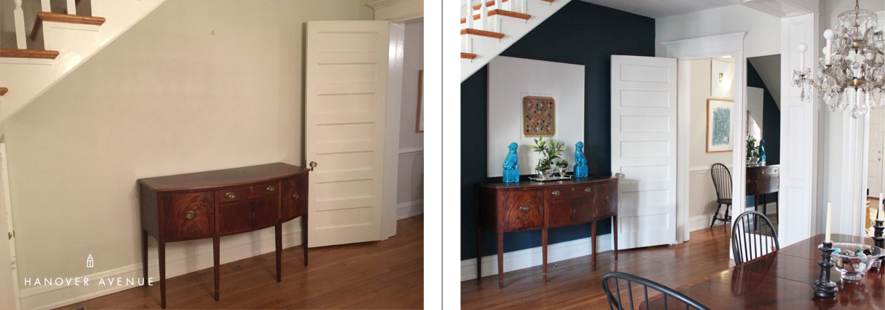
I am always tweaking quarts of paint at home, mixing colors, putting them on boards, and then asking the neighborhood paint store to color match my creations. That is exactly what I did with this deep blue below – it’s a blend of several gallons of paint I had in the basement! I love making my own custom colors, and the paint guys are always eager to help. To read the story of the story about the transformation below and to get the custom blue paint formula, click here.
Pro Tip: to neutralize a color, use the color opposite it on the color wheel. For example, if you want to make blue less blue (but not lighten the shade), add orange / if you want to make green less green, add red / if you want to make purple less purple, add yellow. *And rarely add black because it can dull a color down rather than darkening it!
3. Let the fan deck be your guide.
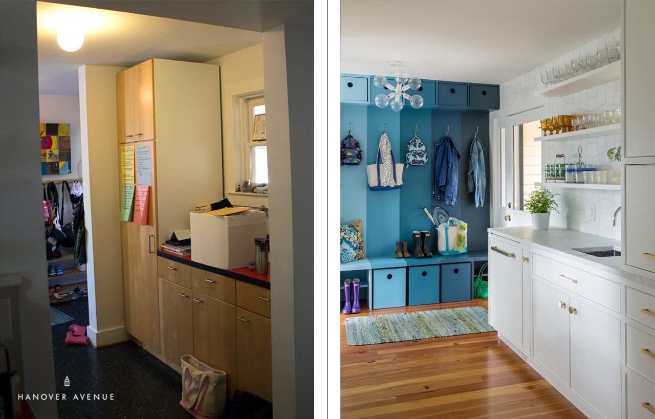
We designed this custom mudroom storage space, but these colors could have just as easily been painted directly on the wall to create the same impact. I found a Ben Moore hue I loved, and used the same colors listed on the fan deck strip to create this ombre effect. Out of respect for these clients, we don’t want to reveal these specific colors, but a great jumping off point blue is Sherwin Williams “Connor’s Lakefront”.
Pro Tip: This is a simple look to recreate. Just pick up a free fan deck from any paint supplier you love, choose a color you like, select several lighter shade that corresponds to it on the fan deck strip, tape the wall off into straight lines, and paint away!
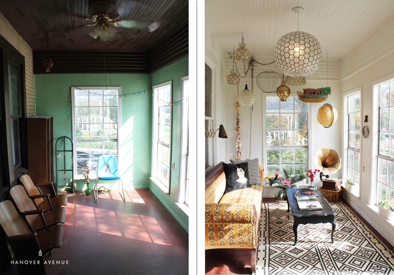
4. Paint the wall trim and ceilings the same color.
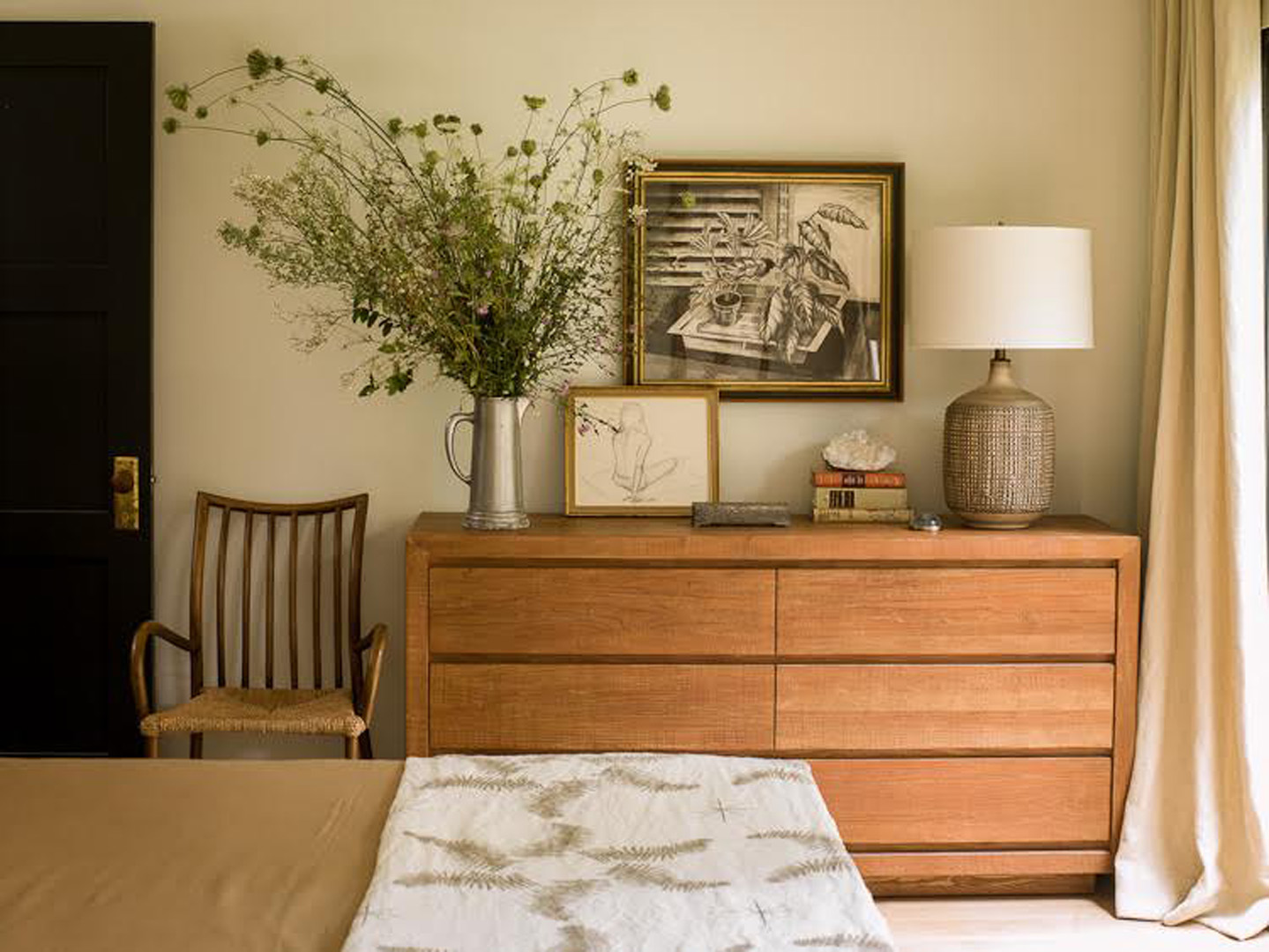
This is a fantastic trick in a small space because it keeps the eye moving around the room without visual distraction. This technique also offers up a wonderful blank canvas to go wild with art and accessories as it keeps the focus on the things rather than the walls. Before this sunny room looked dark and medium-terrifying, now it’s light filled and bursting with personality. The paint color I used is Benjamin Moore “French Canvas” and it is one of my secret weapons.
Shop The Look
All paints are listed in the story, but because we know it’s fun to shop some of the goodies in these rooms, we’ve linked a few below.
Have you had a fun transformation with paint? We love hearing from you guys and seeing how you are making your own spaces amazing. Hope this story inspires you to grab a roller brush and get after those walls!
xoxo
Anne
