THE DESIGNERS
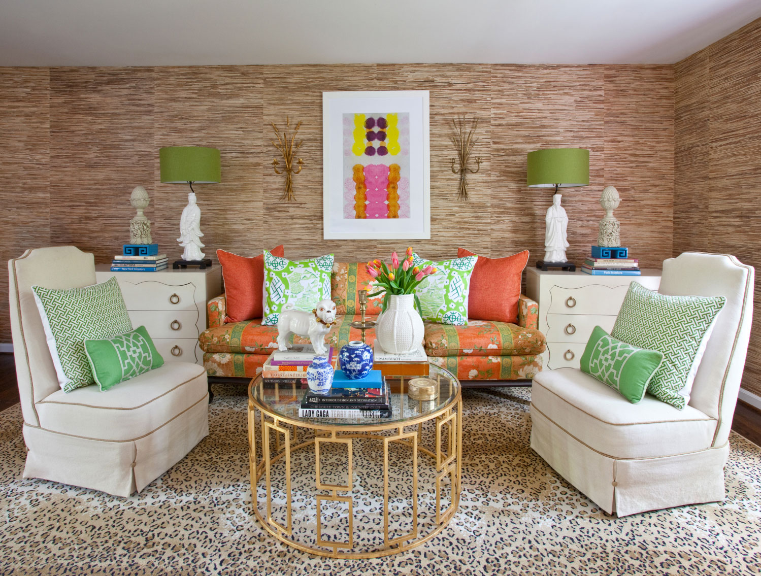
Dynamic duo Lance Jackson and David Ecton are the brilliant gents behind Parker Kennedy Living! Partners in love and in business, these talented men use color in their design better than most. And though they’re renowned for their rooms with bright hues, they’re well versed in the art of neutrals too. Sooooo, we decided to dive deep into their previous living room because it is a perfect blend of toned down foundations with the color volume turned up…check it out! But best of all, we had a chance to interview Lance on film where he drops some insider design secrets. His creative, fun, and “kind-to-the-core” personality shines on film – what a true gem of a southern gentleman – you all will adore him!
SHOP THIS LOOK
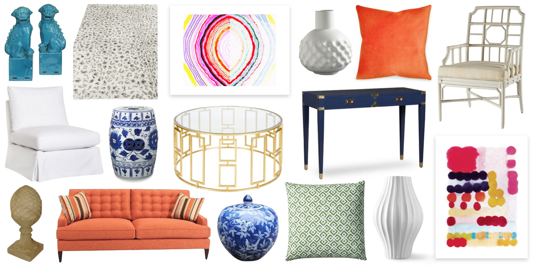
A quick list of what we love!
*And you can click any item below to take you to a detailed shopping list with links to every store!*
BEHIND THE SCENES:
Just look at how sweet Lance Jackson’s smile is! Watch as we meet for the first time on film, and learn from the master as he shares his brain with all of us. He is as gracious as anyone I have ever met, and his wealth of coveted insider secrets are invaluable! He’s the kind of man you want to spend the day with antiquing and an evening with laughing as you rearrange your living room!
3 TIPS ON HOW TO GET THIS LOOK
1. The perfect backdrop for a room with color is a neutral shade of grasscloth wallpaper! It smartly offers visual interest without chroma. Imagine it like a perfectly primed canvas – anything looks fantastic against it, and best, it can be painted if you ever want to mix things up. Neutral grasscloth is a classic like a cashmere camel jacket that looks good with any color silk tie!
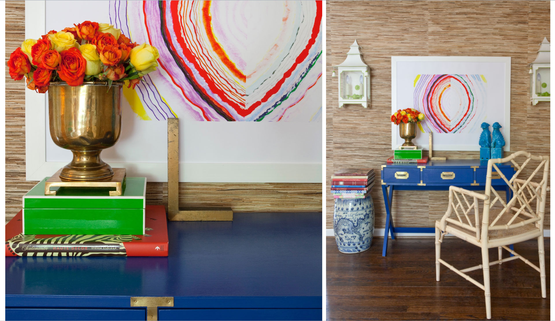
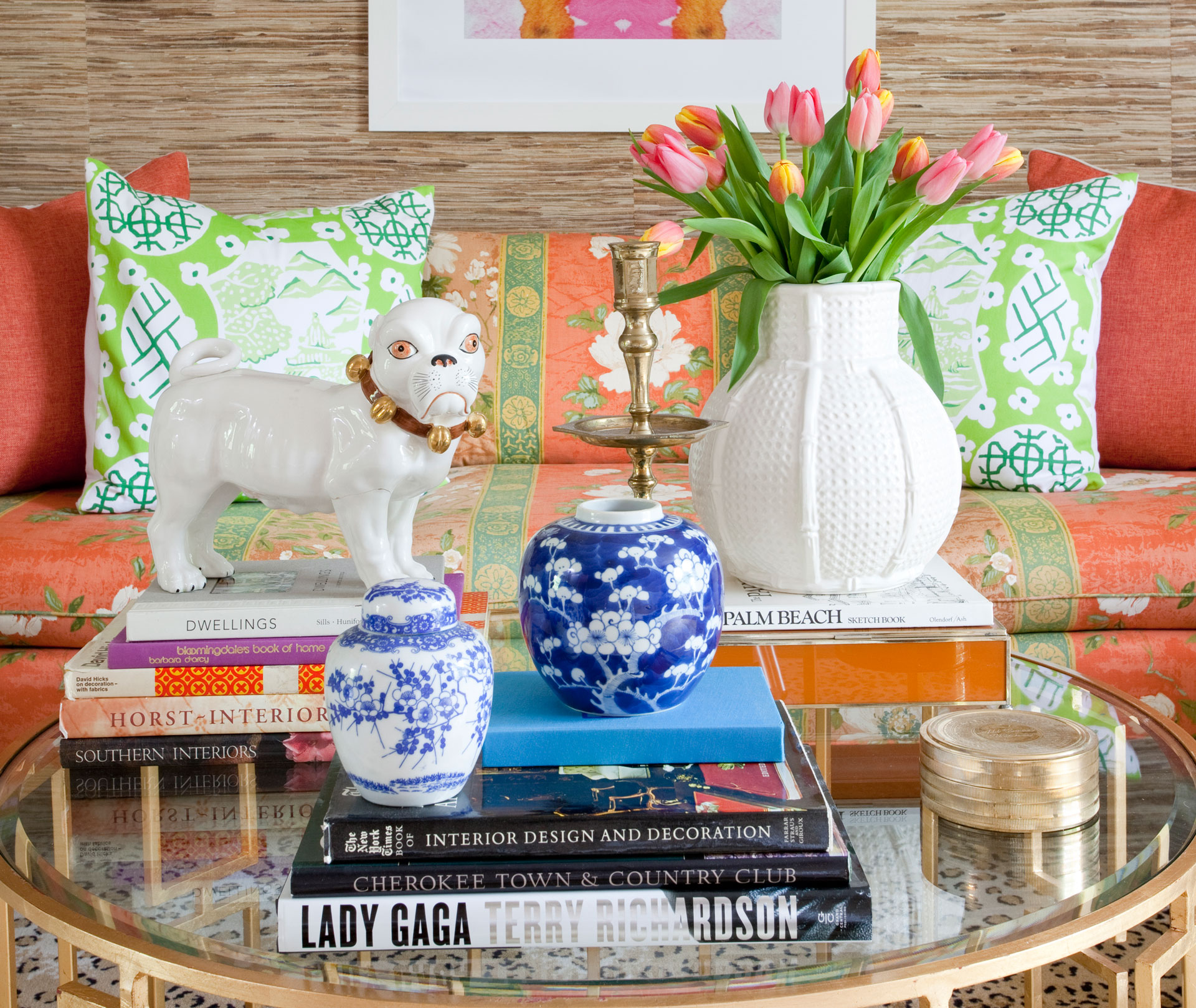
2. Symmetry is your friend, but give it an edge! Lance and David are masters of symmetrical design that stays dynamic. They placed the blue desk on the righthand side of their space which smartly keeps the room from feeling “too perfect”, and they styled the coffee table asymmetrically to keep the room fresh and uncontrived. Think of Cindy Crawford’s mole when you want to understand the way David and Lance use asymmetry: Cindy’s face is inherently balanced and classically beautiful, but her beauty mark takes her looks from appealing beauty to memorably stunning. Did we just compare Cindy’s mole to a blue desk?!
3. Mix vintage with new! Remember that you always want a room to have a “history”…. Rooms that are composed entirely of new pieces can tend to look like a one-stop-shop, and you want the space to appear to have evolved over time. The video clip below with Lance offers a coveted look into what Lance and David found antiquing and transformed with paint! They are pros at breathing new life into vintage finds, so bolt to their website to grab up some of their vintage goodies for yourself. Hey Santa, we’ll take a pair of those killer white and green sconces!
THE COVETED DETAILS
Bring on the color! Take note of how Lance and David never “paint by number” when it comes to chroma, rather they mix many shades here by choosing hues from similar values of color. The green with the orange is so chic, but to elevate it further, they kept the color families tight.
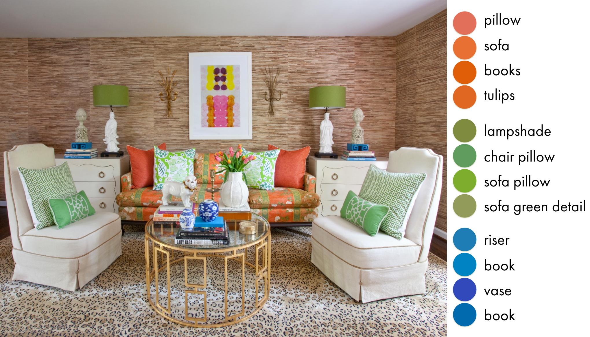
For example, the green in the room has no deep hunters or bold kelly greens; it’s not too matchy-matchy but basically stays in the same value of grass green. Same is true of the orange; it’s limited to a yummy shade of persimmon without injecting bright tangerine or rust. And when they introduce the blues, the cobalt and turquoise are the same value – ie, each of the blues are a different shade but are the same depth of color – one is not much darker or lighter than the other….See how cool this is?!
INSIDER SECRETS!
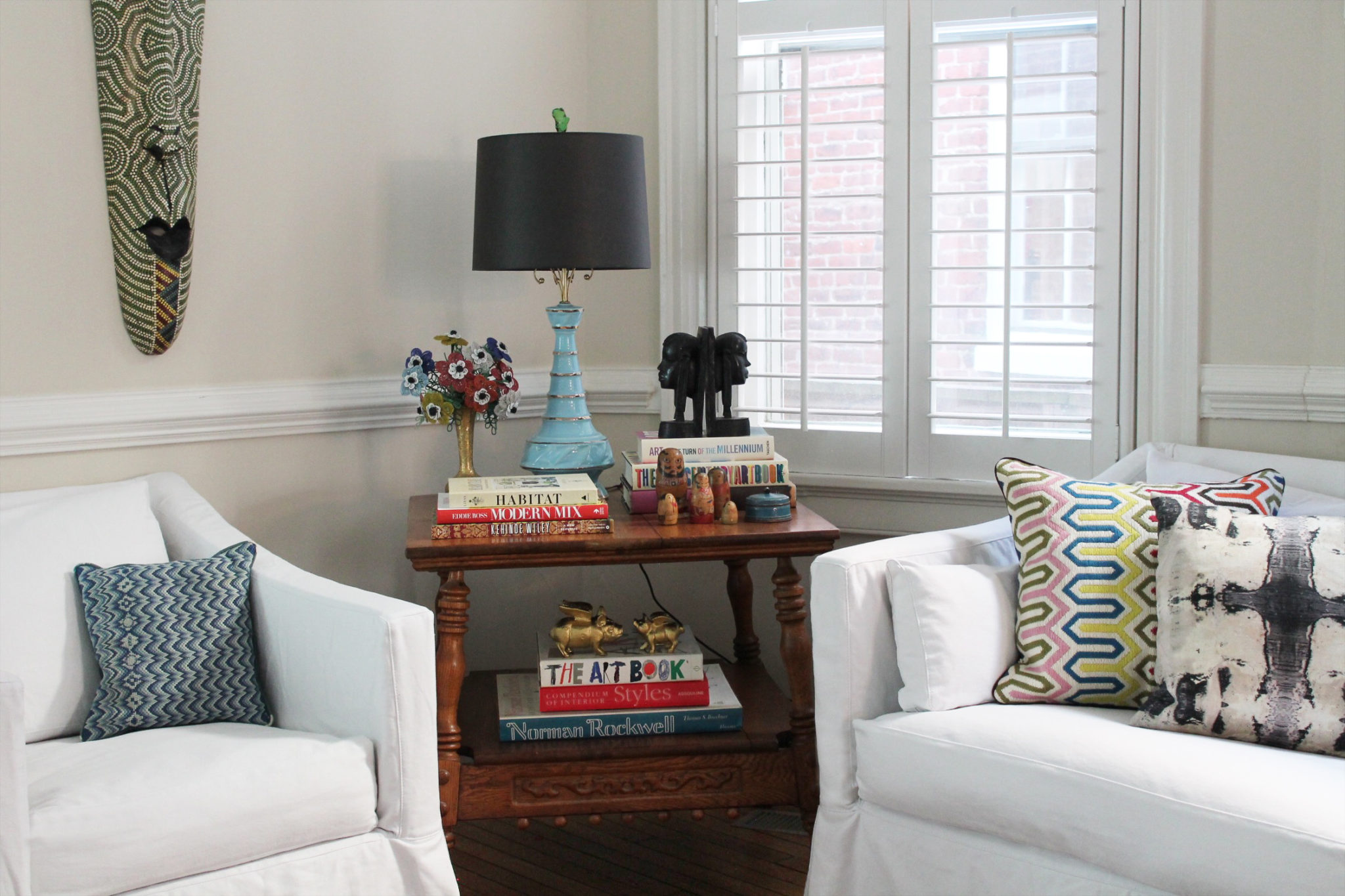
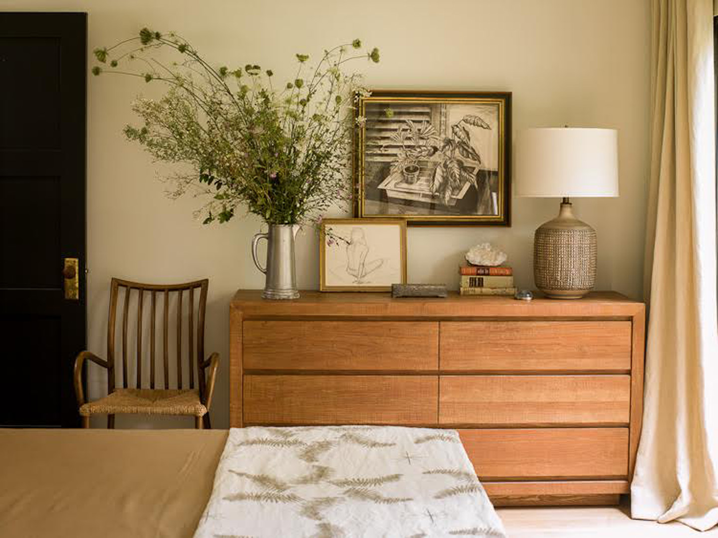
((!*Gasp*!)) More Parker Kennedy Living magic at work…. Look how The Fab Duo created an amazing vignette that feels cheery with the chroma dialed down a bit. The basics are neutral as they inject hits of color through the accessories. We show you where to shop this look, but BEST, we show you how to make a fun DIY dresser like this one for only $183.14! BaBOOM!
PHOTOGRAPHY
The images of Lance and David’s stunning home were captured by the incredibly talented Christina Wedge. Based in Atlanta, she specializes in lifestyle and interior photography, and her portfolio is absolutely spectacular! Head over to her website to check out even more of her stunning work.
We hope you have a blast recreating this look in your own house! And for even more inspiration, be sure to follow these fab designers on Instagram, Pinterest, and Facebook! They have talent galore but most of all, they are SUCH nice people! They work with clients all over the map, and having their vibe in your house literally will make your home a lovelier place to live. Thank you so very much Lance and David for opening your house and your brains up to our readers!!
xoxo
Anne
