It’s like Alice drank the potion!
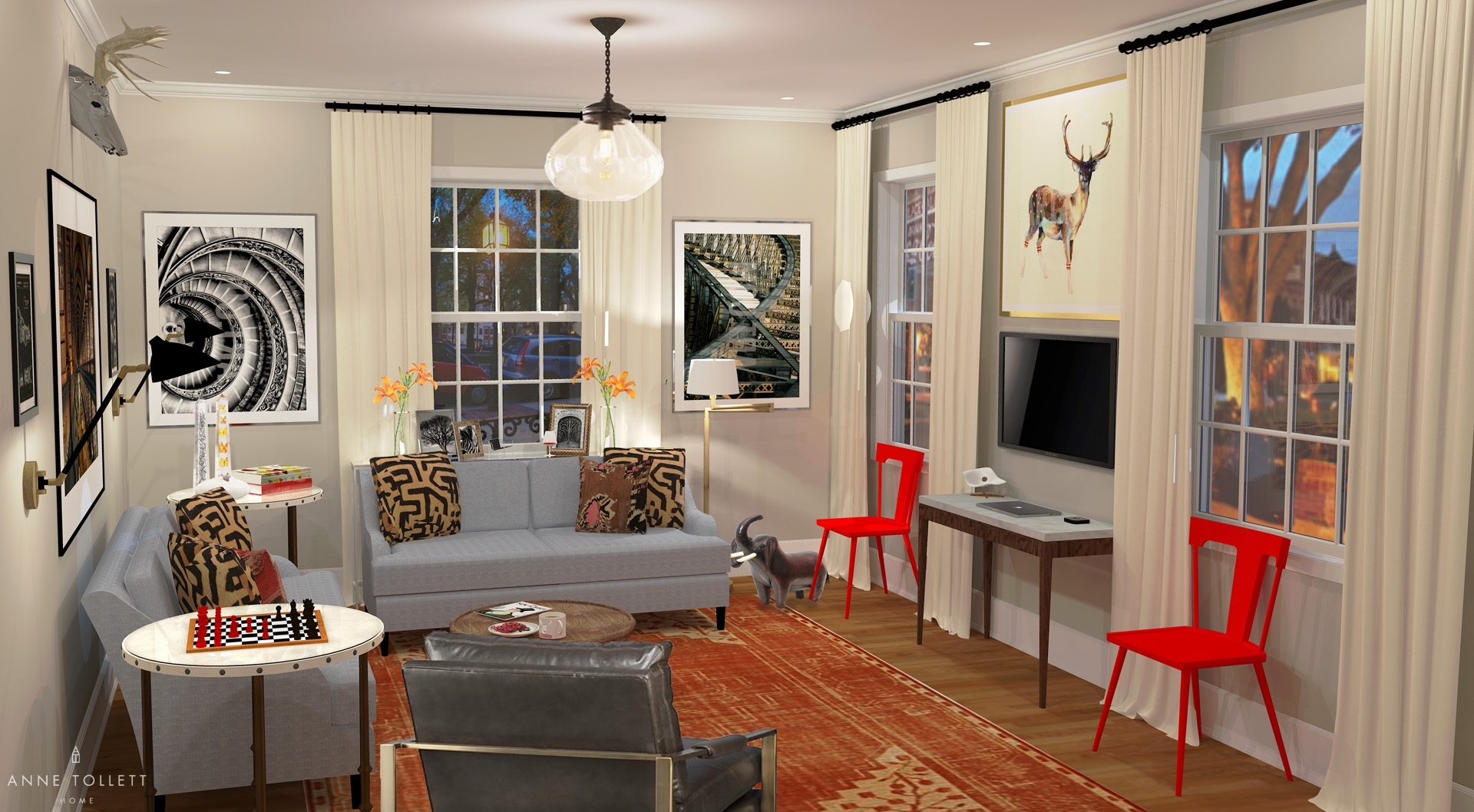
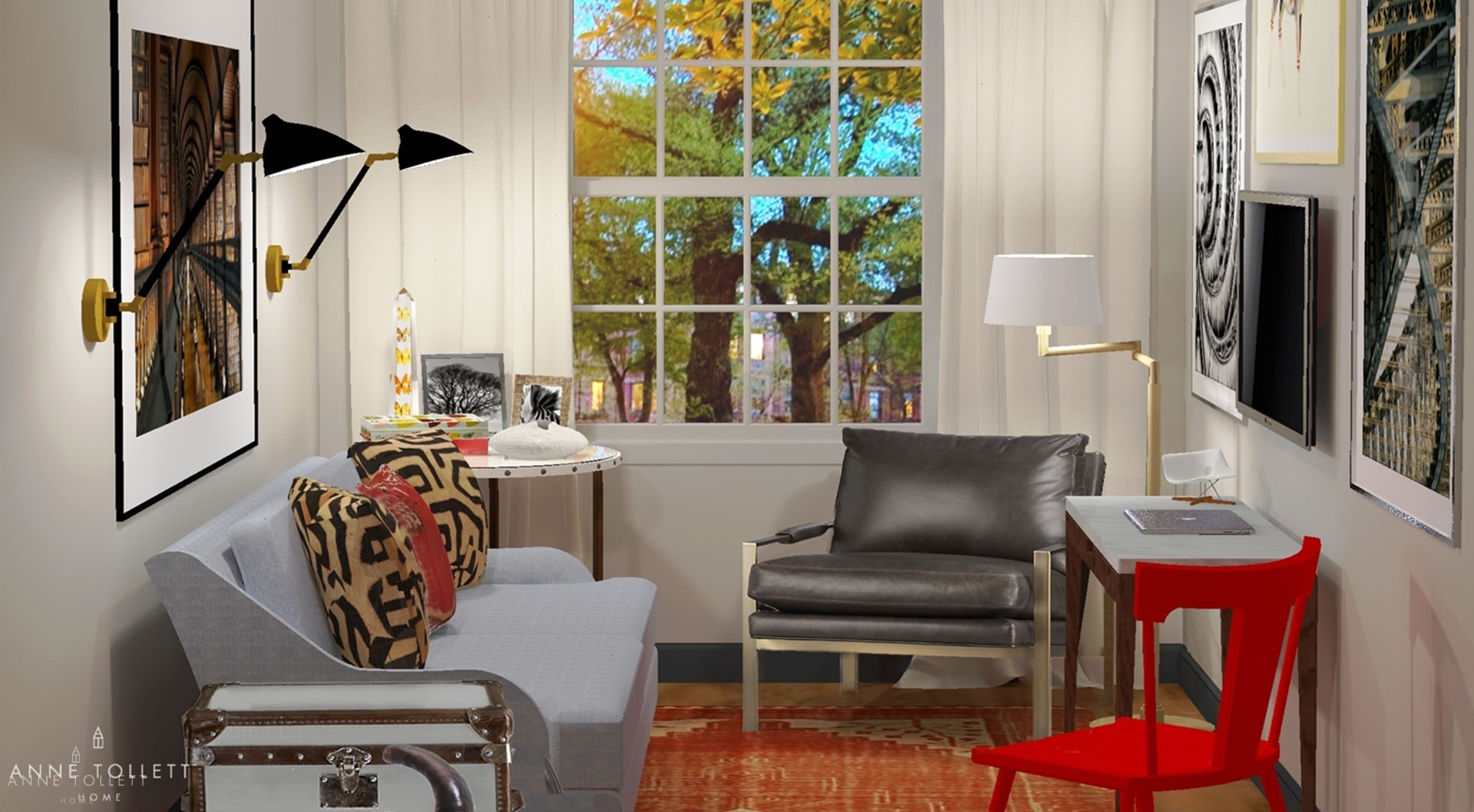
What was once a teeny room is now much bigger. Many of you may remember seeing this space as the “Tiny Room” a few weeks ago, and as promised, we wanted to show you how all of the same pieces could work in a bigger room. *magic!*

The Furniture
All of the furniture stayed exactly the same: the only difference is that we made many of the single pieces a pair! Though sectionals serve their purpose, we’ve never been the biggest fans, so wherever possible, we pair identical sofas instead. We were so excited to take advantage of the added space! The two side tables now play different roles: one for display and the other for games. To offer more seating, we paired the red side chairs, which also add that extra splash of color.

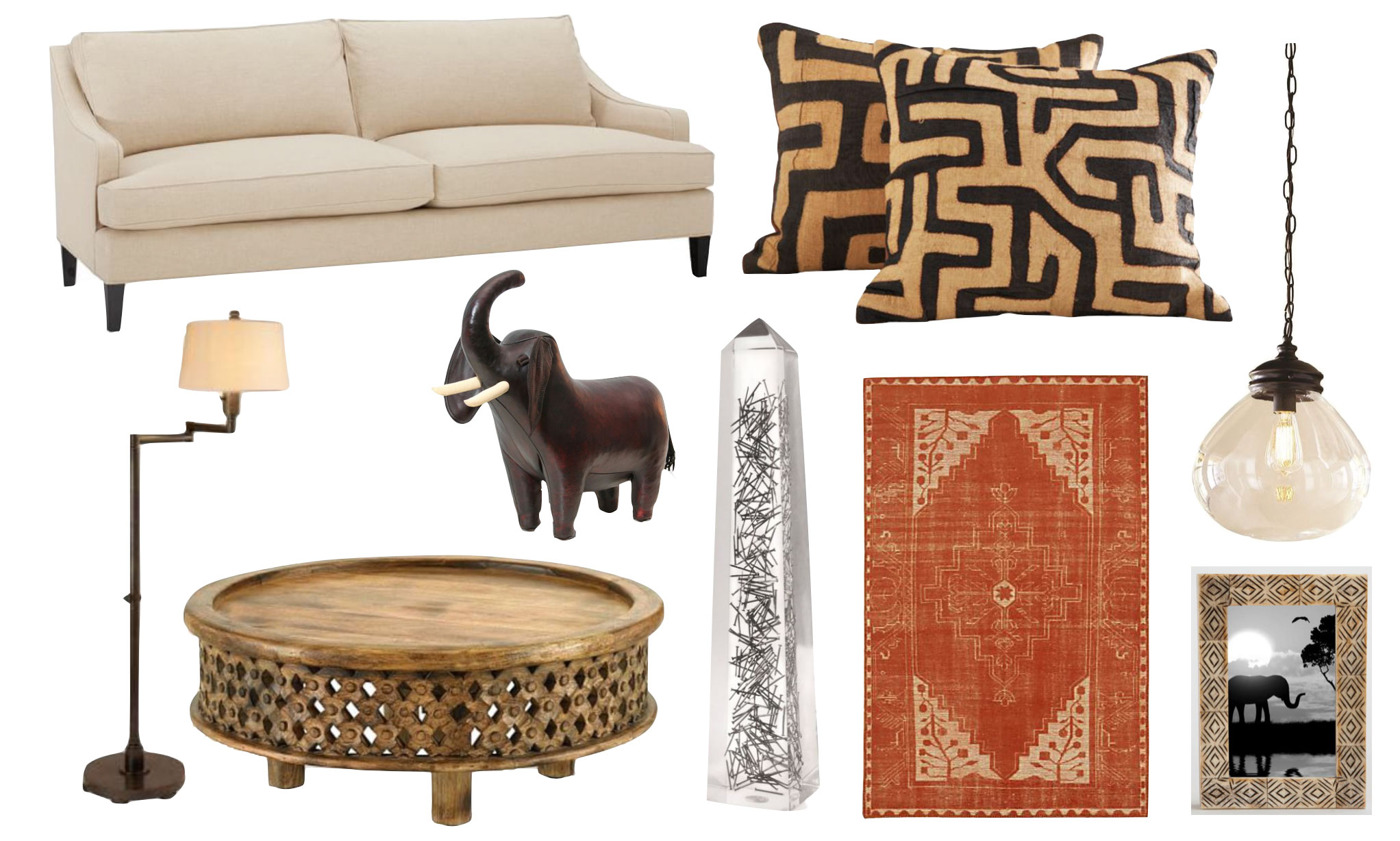
We still loved the lean profiles of the furniture, so we kept them to express a modern sensibility. It works well with the overall ‘global vibe meets mid-century’ look of the room. And I’ve said it once, so I’ll say it again: This leather chair looks crazy expensive in person but it’s not. It’s a must-see!

The Paint
Because the room is no longer teeny tiny, we decided to move away from the “lacquered jewel box effect” to avoid an overwhelming glossy and gaudy look. We still applied Benjamin Moore’s “Calling Wood” (OC-28) but now in a washable flat finish. With Benjamin Moore’s “Decorators White” on the trim the paint application is fresh and traditional.
The Fabric & Finishes

This room packs a ‘textural punch’ without overwhelming the space. This is a delicate balance, which is achieved by repeating themes throughout the room. The leather of the elephant cleverly echoes the leather of the armchair without feeling contrived. A chrome skull introduces a metal element that’s reflected in the bronze of the armchair and brass of the lamps. Variations of red are the only repeated hue.
And speaking of red, we wanted a little hit of red on the coffee table and I remembered making these phenom red velvet cookies. They are sinfully good! So yummy, you cannot eat just one, but this room is all about pairings, so eat two without guilt because it is “part if the design”! ((chuckle))

To further the look of mid-century sensibility colliding with a global vibe, we were mindful down to the books we selected! A mini Eames chair, a large and textural low vase, lucite obelisk, and perfect picture frames. . . each piece carries its own weight while harmoniously adding to the room’s story.

The Accessories
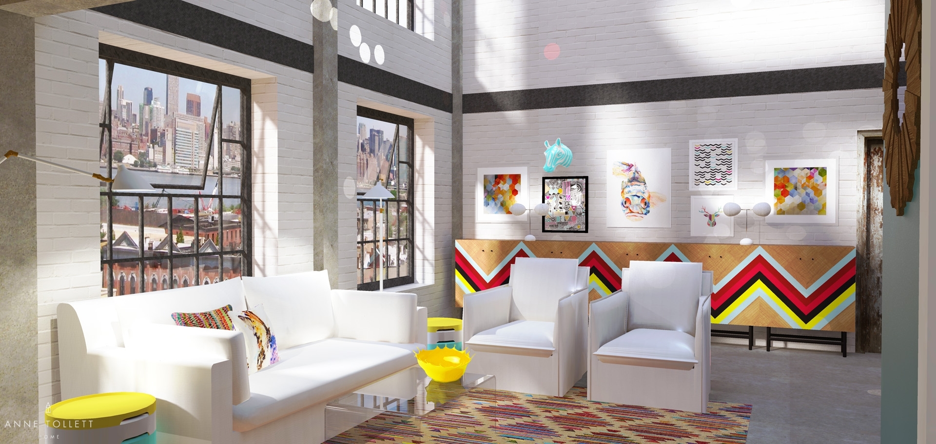
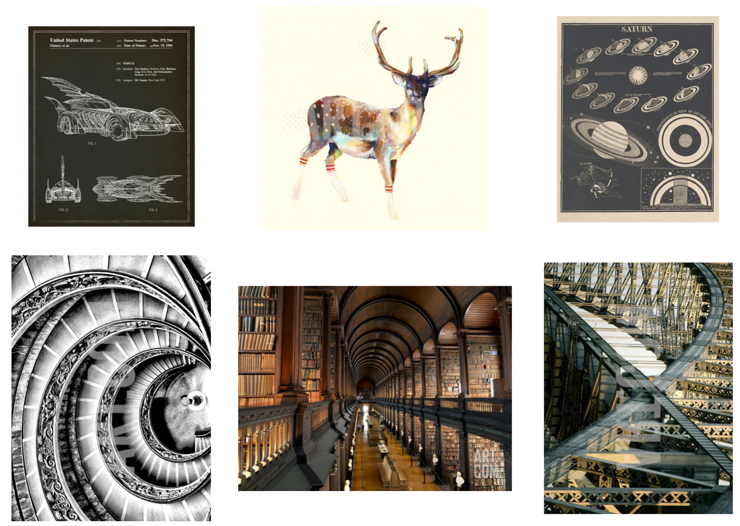
The art and accessories draw the eye in, yet do so with a simple, neutral palette. This lends a ‘gallery’ feeling without making the room appear cluttered. We increased the size proportions of the art to balance the extra square footage, and spread out the pieces to create a separate statement on each wall. The supporting sconces still double as table lamps, but now extend that feeling of an art display throughout the space.
The Layout
See how much style we packed into the original Tiny Room? By choosing principles that could be applied to any square footage, we were able to take the same aesthetic and apply it to a completely different space!
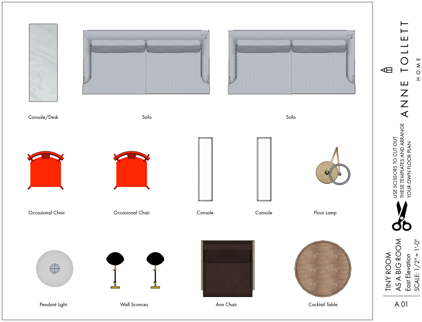
The floor plan in your house will likely be different from the one pictured here. That’s not a problem! Right here we show you how easy it is to reconfigure everything from the Tiny Room in your own space.
At last, you can stop making costly design mistakes!
Here is a rendering just for you, a scaled printable floor plan with elevations, and a buying guide of where you can buy every item in this room.
Happy Shopping!
xoxo
Anne
