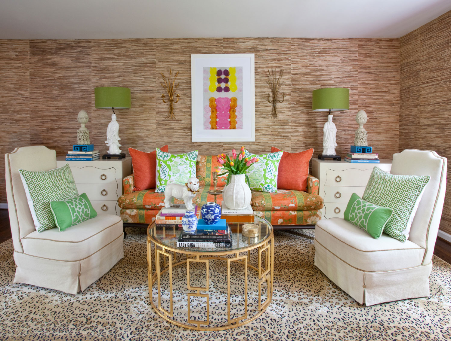

You say poTAYto and they say paTAHto! Have you ever come to realize that while you love your significant other, you’re just not in love with their sense of style? Getting couples to agree on the look of a space is one of the most common problems in interior design. And while having two drastically different tastes may seem like a clash of the titans, we’ve found that the best (and some of the most memorable) rooms often come from a collision of styles. There is beauty in chaos! In this room, we combined two polarizing tastes: traditional vs. modern. Giving a fresh twist to classic silhouettes and patterns, we created an interesting hybrid that allows both styles to play off each other with a timeless vibe. See how we made it work in this room.
The Fabrics and Finishes
Using an old trick most couples rely on to move past an argument, we made the fabrics and finishes “agree to disagree.” (Ever done that? We did it last week on pizza night – those olives!) Fusing a seemingly disagreeable mix of traditional and modern pieces, we established a sense of agreement and unity in the room by using similar materials and colors to ground they eye in the space.

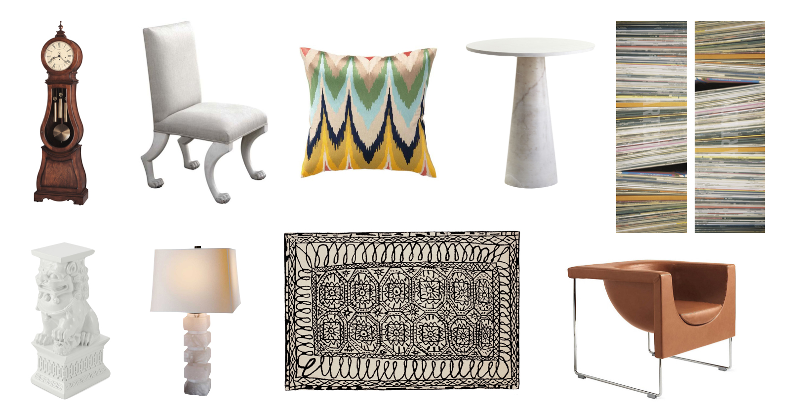
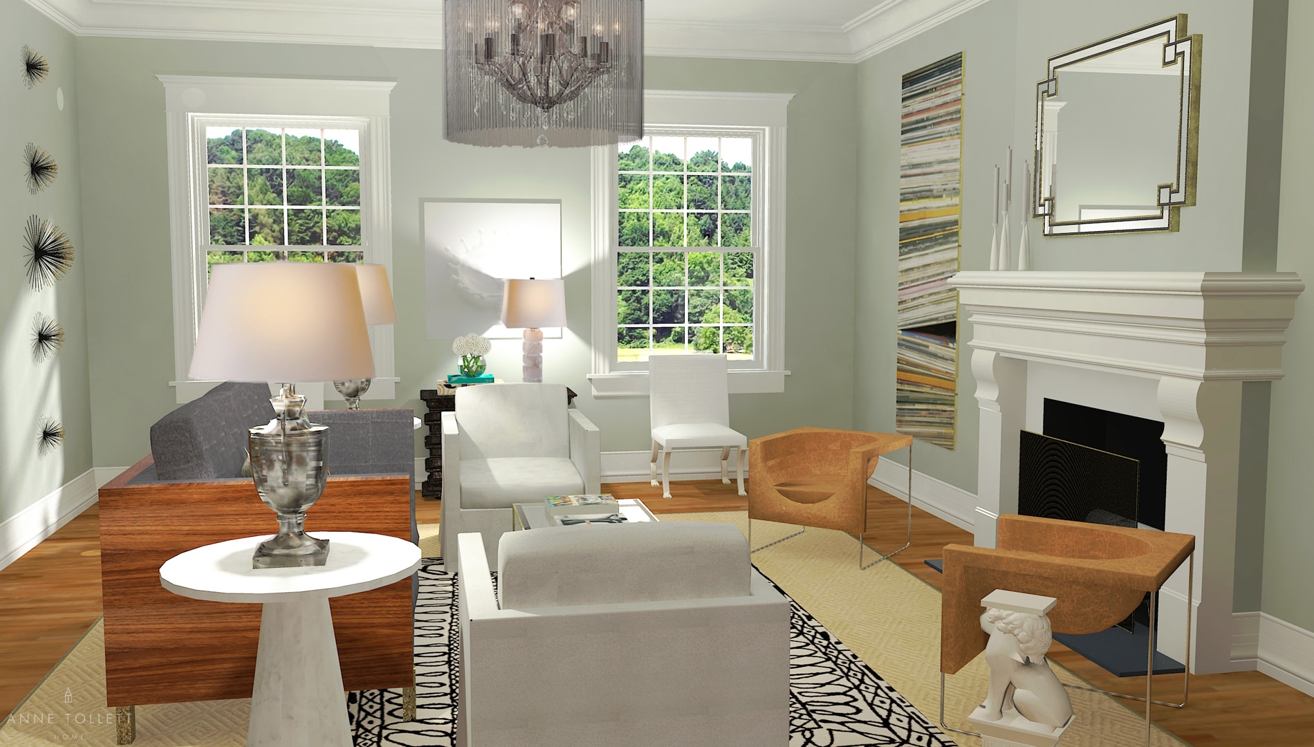
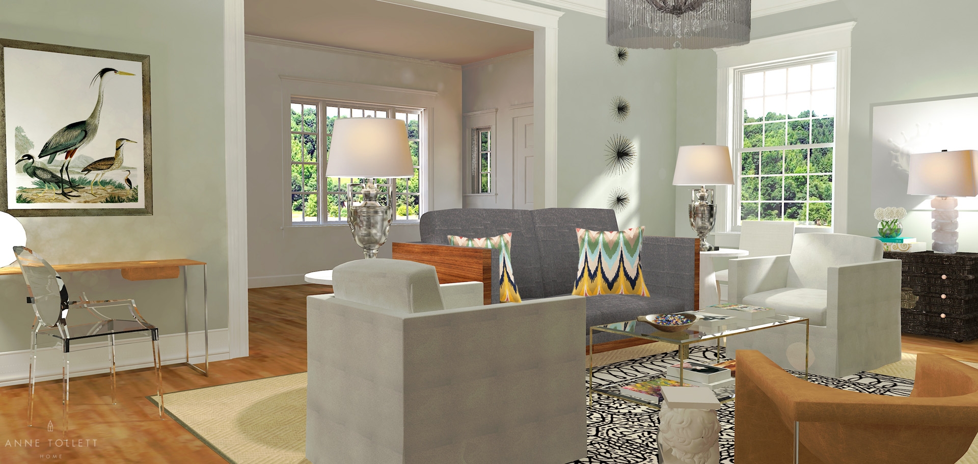
Key textures are repeated in the room: leather, wood, marble, touches of metallic and silk. The wooden finish on the grandfather clock echoes the back of the mid-century style sofa, while rich leather make desk and armchairs that much more fabulous! We like how the marble of the end tables and lamp lend a classical feel to the space despite having very modern profiles, and the flame-stitch pillows in silk offers a refreshing update to traditional embroidery. Touches of metallic on the mirrors, coffee table, and legs of the leather chairs and desk complete the modern look.

One of our old standards is mixing vintage or Persian rugs with seagrass, but here we wanted to give it a modern twist. We love how a traditional rug pattern is completely transformed by a hand drawn line quality. It feels artistic and fresh as if an antique was reinterpreted in pen and ink – a perfect solution when merging aesthetics!
The Paint
To keep the focus on the art in the room, we chose a classic, neutral shade that lends a gallery aesthetic to the space without the blandness of white walls. Farrow & Ball’s “Light Blue” No. 22 gives the room a calming contrast to the different works of art, while still imparting a distinct personality and punch through the hue.

The Accessories
In most modern environments, the accessories are kept to a carefully considered minimum, so we made that the goal here. The porcelain Foo Dog is both sculptural and artistic, and while it’s charming and useful as a place to put a drink, we specifically chose it because of it’s dialog with the feet on the white chairs. BowWow!

The room was starting to feel very slick, so we wanted to introduce a hand touched quality. This is when we found a wonderful wooden bowl which we filled with vintage marbles. Marbles are a friendly and charming conversation piece – so unassuming yet an impactful accessory.

“Invest in these books! They are usable art that expand your brain.” At least this is what we tell ourselves each time we gleefully bring home another one! You’ll find a few of our favorites in this room. Colorful, textural, sculptural, beautiful – need we go on? Which leaves us with art. The gallery quality in this room was so carefully considered.

We love making “off the rack” art all our own which is exactly what we did in this room. The paring on either side of the fireplace are just prints that we enlarged and turned sideways. Now they look like important pieces rather than kitschy photographs of album covers.

The star bursts are “off the shelf” as well, but we just hung them very specifically to make them look custom – the same is true for the climbing men. Lastly we blended tradition in the bird print with the modern splash of the milk piece, both of which work seamlessly with the rest of the room.

The Furniture
We can’t stand being expected, so we updated classic silhouettes with unexpected accents to make the eyes do that coveted double take! Simple, geometric shapes immediately give the room a modern feel, while traditional accents provide interesting contrast.

The clean lines of the mid-century modern sofa, linen armchairs and leather seating impart a crispness throughout the room. Classic claw feet are updated with a white coat of paint, while the Louis VXI-style armchair pops in a fresh ghost acrylic finish.

We also gave circular shapes center stage in the room. The Dioscuri table lamp’s spherical silhouette echoes the round face of the grandfather clock, the circular chandelier, vase of flowers, the tops of the end tables, back of the Louis XVI armchair, and focal point of the Tara Yamada wall print – even the seat of the leather chairs are a nod to the circle! Keeping these simple geometric figures in mind as the eye wanders adds another element of unity to the space.

The Layout
The layout is always the trickiest part, especially for a room already faced with the battle of contrasting styles. We decided to take the modernity of the furniture and place them in a traditional living room layout.

The fire place is the centerpiece of the room so the coffee table echoed it and set the plan in motion. We paired the tables, linen chairs, leather chairs, and lamps configuring them opposite one another and establish symmetry. Using a traditional layout give a sense of familiarity to a room, allowing the eye to easily marry the contrasting movements in design. In the weeks to come, we’ll show you how to pull off this look in a smaller space that lacks the luxury of high ceilings or a fireplace.
Make It Your Own
Our biggest wish is that you get to experience the thrill of designing gorgeous rooms without the worry of design missteps. We all want a pretty house that reflects who we are and how we love to live – now it’s so easy. The floor plan in your house will likely be different from the one pictured here. That’s not a problem! You can reconfigure everything from Opposites Attract in your own space. Our Design Guide and Buying Guide outline how to easily recreate this room in your own home.
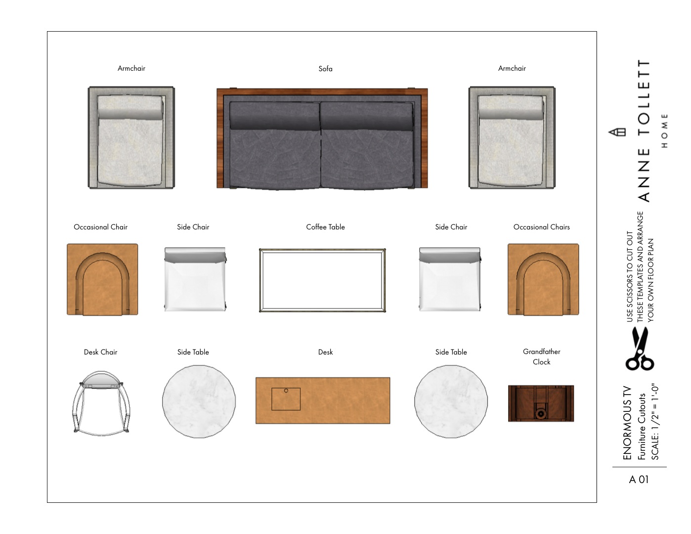
At last you can stop making costly design mistakes! Below is a rendering just for you, a scaled printable floor plan with elevations, and a buying guide of where you can buy every item in this room.
We always include complimentary 1/2″ scaled cutouts in our Design Guides for free, but if you would rather have 1/4″ scaled cutouts, here they are!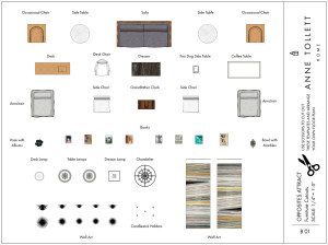 Sooooo, go find your SweetiePie and make your styles work together! ToMAYto, ToMAHto definitely don’t call the whole thing off. ((wink))
Happy Shopping!
xoxo
Anne