THE DESIGNER
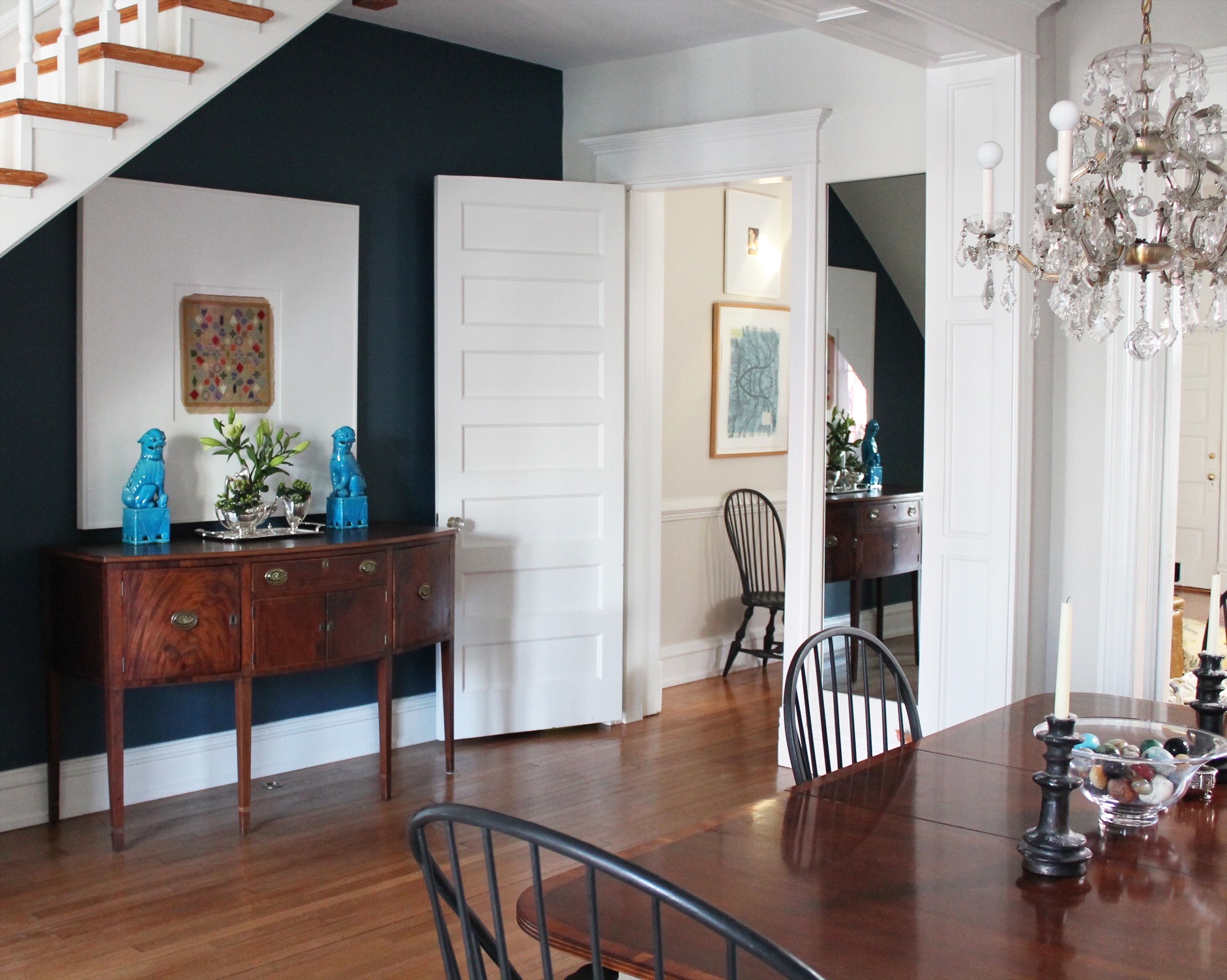
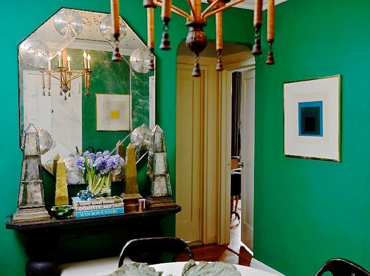
Cute as a button with design talent out the ears, Ashley Darryl is taking the design world by storm! We love a designer who remains humble in the wake of a meteoric rise, and sweet Ashley takes her deserved success in stride with a warm Texas chuckle. She has paid her dues in the design world learning the business from the ground up from the best of the best, and now it’s her turn to shine…. She’s working on some of the most desirable projects with a style that’s refined, thoughtful, and best of all, livable! Ashely opens her entryway up for all of you lovely readers and shows how she created a space that also plays double duty as a dining room. *Gasp* It’s Ashley’s Emerald Entry!!
Photography Credit: Evan Browning


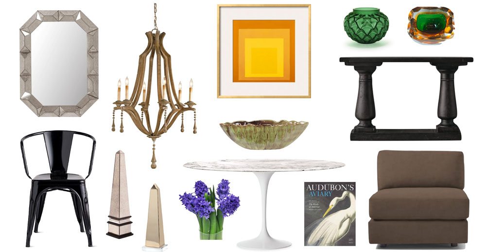
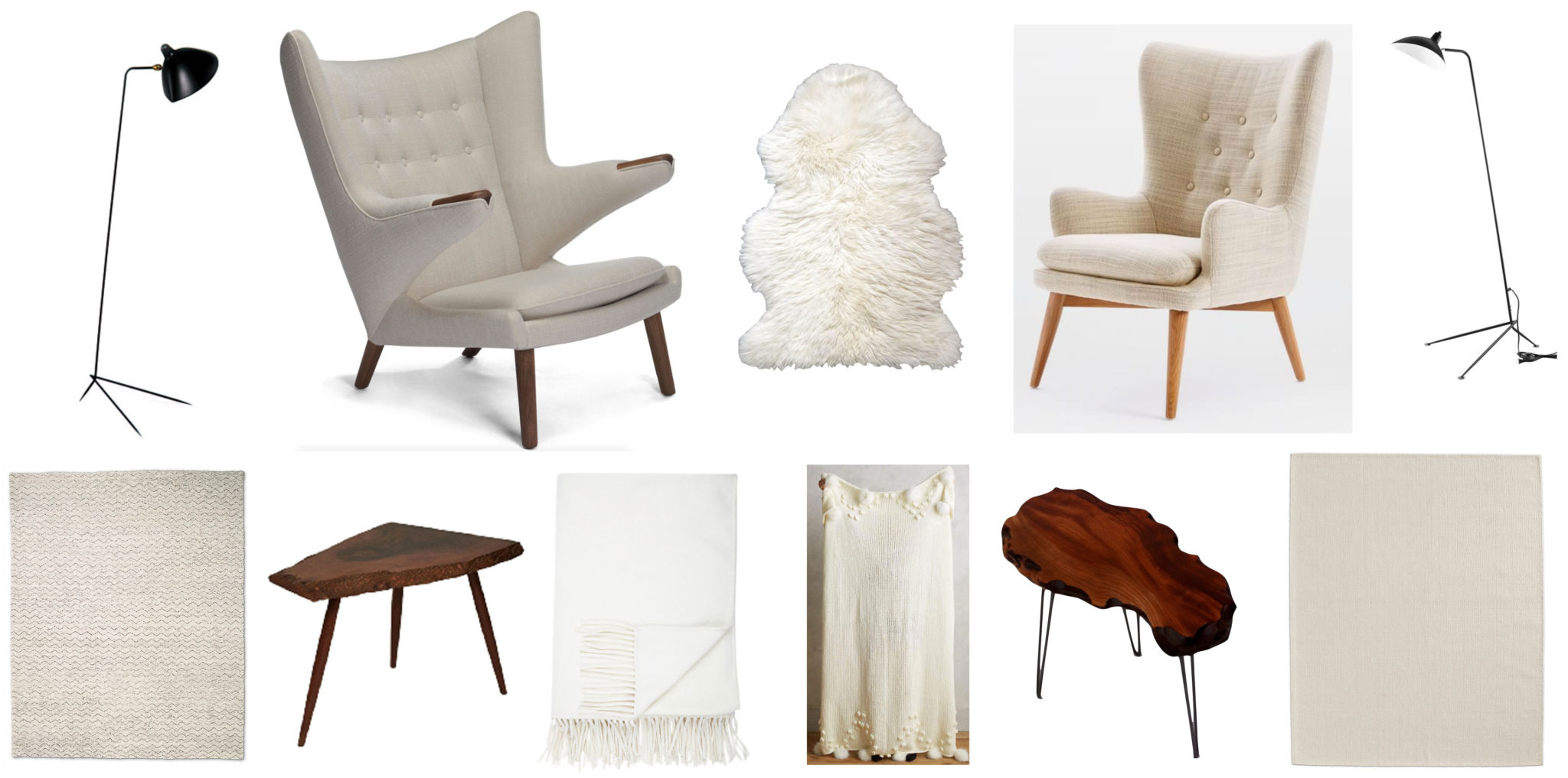
SHOP THIS LOOK
A quick list of what we love!
*And you can click any item below to take you to a detailed shopping list with links to every store!*
BEHIND THE SCENES
We got to sit down for a fun interview with Ashley, and boy is she ever smart and sweet! It feels like hanging out with an easy going buddy from camp as she lets the design tips fly. Learn all of the insider secrets behind her room and fall in love with this fantastic designer. Ten bucks says you want to hire her after you see this!
3 TIPS ON HOW TO GET THIS LOOK
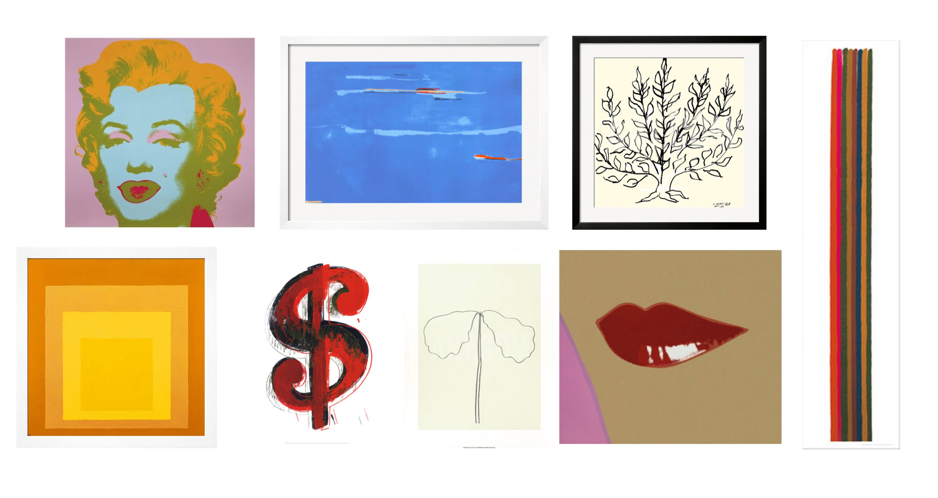
1. Pattern repetition makes the beat go on! This room is inherently a square, and Ashley capitalizes on that with the Albers prints and the boxy, Billy Baldwin chair. She doesn’t overdo it, but these subtle shape repetitions give the rooms a lovely edge. Even the bases of the obelisks are squares!
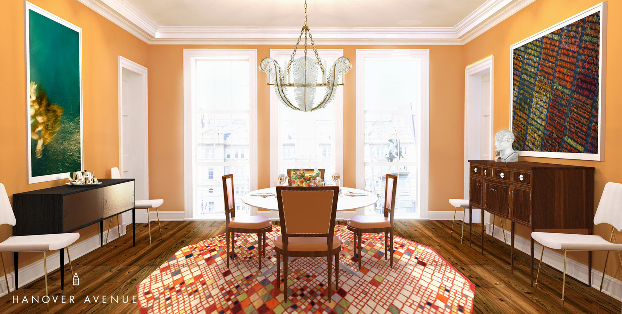
2. Double duty space is cool at any size. In small NYC apartments or large country farmhouses, transforming an entryway with a dining table is chic all day long! It feels gracious, unexpected, and capitalizes on otherwise dead space. What a wonderful room to eat dinner with friends!
3. Unlikely pairings are a match made in heaven! Mixing organic or vintage finds with slick, more modern pieces allow a room to feel like it evolved over time. It looks unstudied yet perfect, and it ensures a space has “history”. Look at that Saarinen table with the flea market chandelier!!! PitterPattttt goes our hearts!
THE COVETED DETAILS
Ashley selected Benjamin Moore’s Emerald Isle as the paint color for the walls of her Entry. And we’ve added a few more of our favorite green paint colors for you to explore:

Kelly Moore – So Sari, Farrow & Ball – Arsenic, Benjamin Moore – Peridot, Sherwin Williams – Starboard
INSIDER SECRETS!
OoohhWeeee! We love how Ashley goes from high chroma to mellow sophistication in her living room. Check. This. Smart. Cookie. OUT! We show you what she did and where to shop the look. It’s the mark of a talented designer who can rock both colors and the neutrals with ease!
Photography Credit: Evan Browning
MAKE IT YOUR OWN
We hope you all have a blast following Ashley’s lead with green on your walls and recreating her vibe in your own house. For even more inspiration, follow Ashley on Instagram! Her feed is endless eye-candy of her own work and images she admires – it’s a treasure trove of awesome. And of course she is on Facebook and Pinterest! And if you love Ashley as much as we do and want to hire her brilliant brain to transform your whole house, here’s how you can make her your designer!
xoxo
Anne
