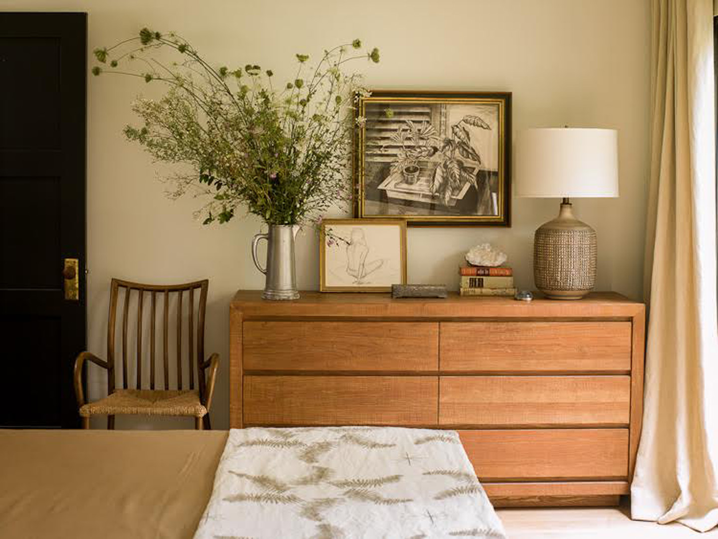
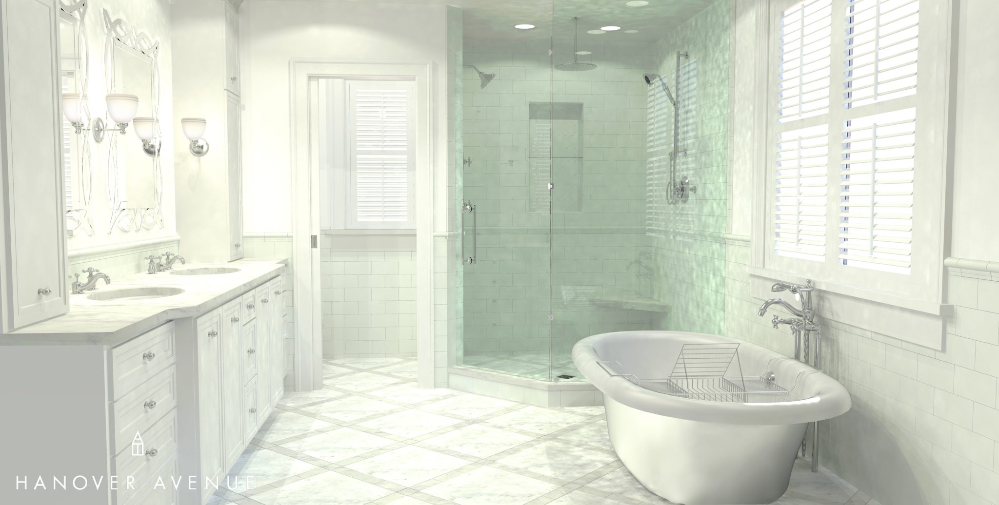


Finding a versatile and light color that doesn’t look like “builders beige” is a wonderful moment for an interior designer! So often, pale neutrals can feel anemic and flatten a space in two coats, so having an arsenal of dynamic light neutrals is critical in this business.
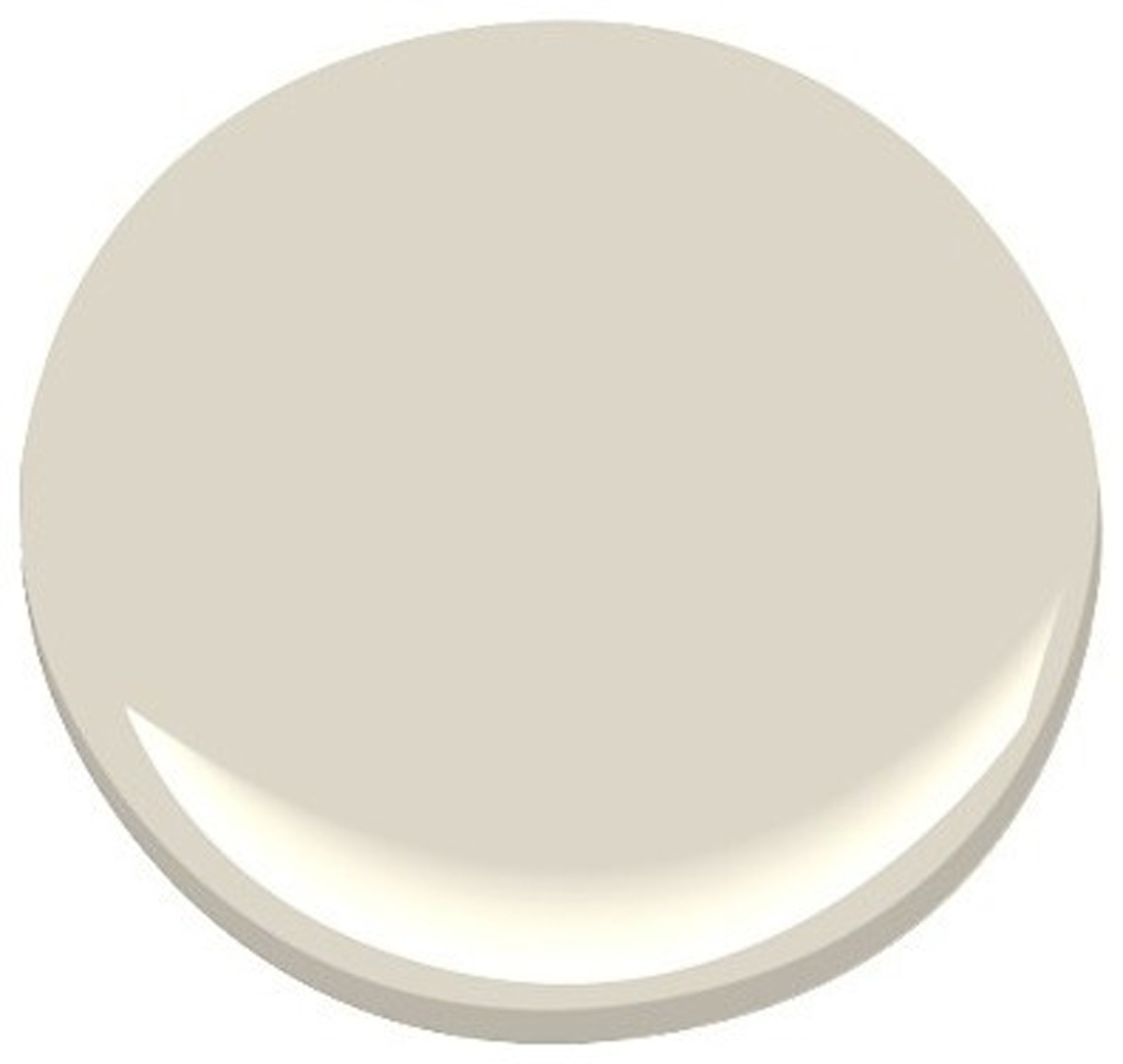
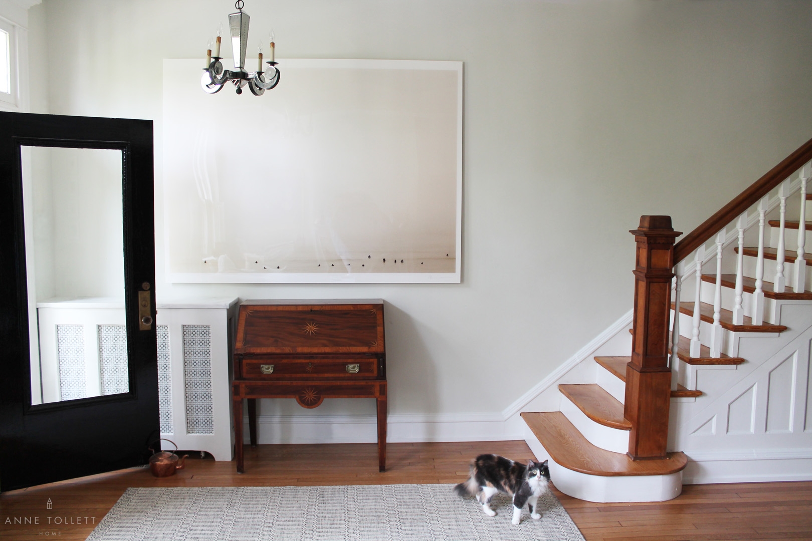
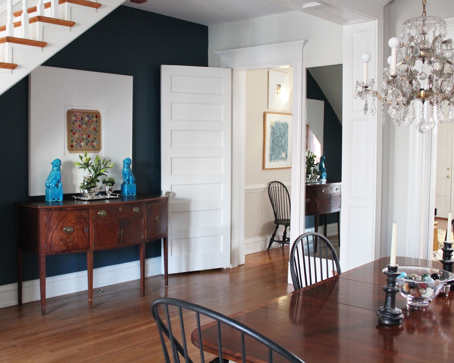
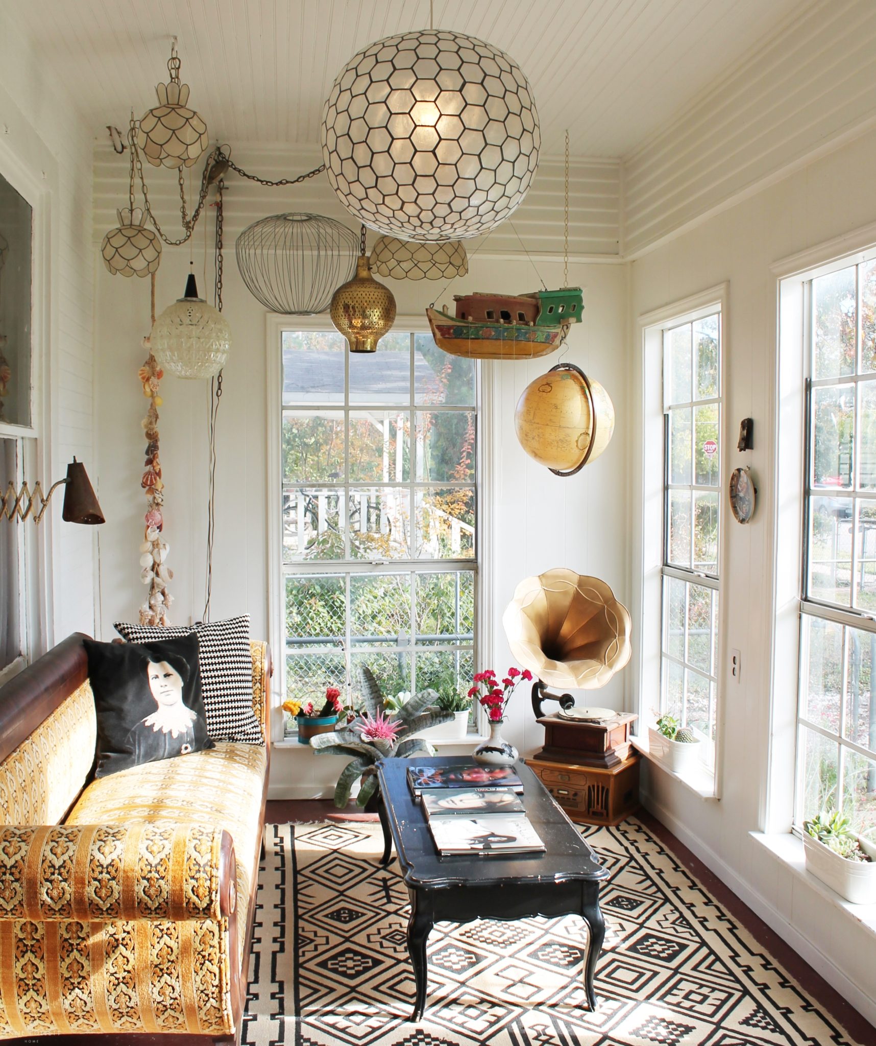
“Nature’s Essentials” (1521) by Benjamin Moore is one of the greatest paints I’ve ever stumbled upon. It works in any room, but I use it most for spaces that have no clear end in sight. This shade shines in houses with expansive open floor plans or rooms with odd angles that seem to just flow right into the next.
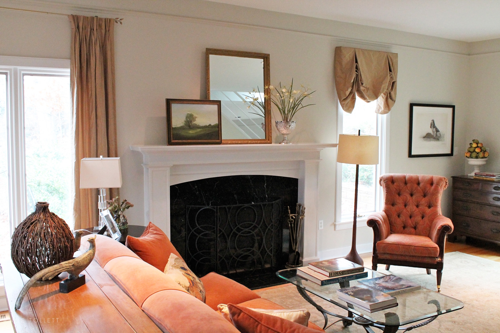
This color is a neutral, for sure – a beautiful shade that looks like a Dutch Master’s primed canvas ready to take on any palette you give the room – and it won’t go too gray, too pink, too cool, or too warm. It stays a stays true to itself no matter what, and it sings in any light.
If your realtor suggests a neutral for your walls to help sell your house, this is a fantastic choice. Nature’s Essentials is a winner for open floor plans begging for a shade other than white, and makes a wonderful backdrop against your beautiful art and collections. No matter what room you use it in, this paint will make all of your treasures look lovely!
Try this hue the next time you are on the hunt for a versatile color that looks chic in any application….
Happy Shopping!
xoxo
Anne
P.S. Do you know an amazing shade of paint with a crazy name? Send it to info@annetollett.com. Our team will take a vote on the winner, feature you on Anne Tollett Home, and send you a $25 gift certificate to the paint company who makes the color.